Logo Builder
Everyone becomes a designer with this intuitive sketch-based interface.
client
Universe
role
solo designer
timeline
3 weeks, 2022
tools
figma, sketch, drama

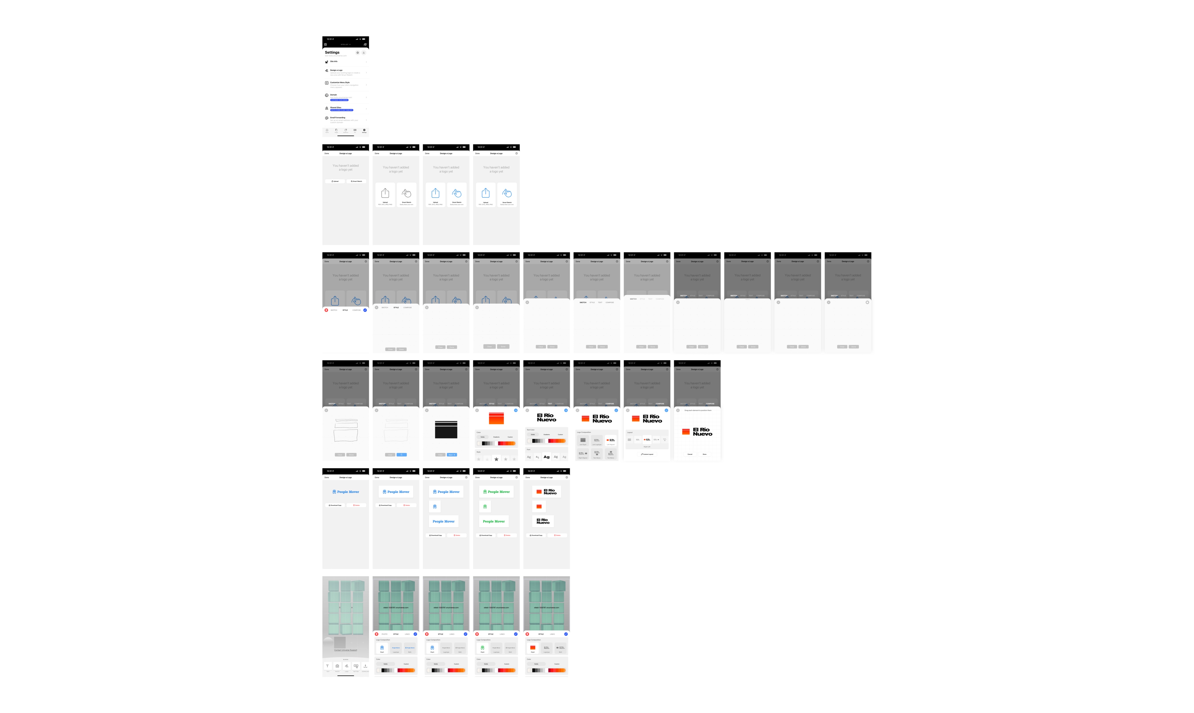
I think technology is at its best when it inspires people to be creative. The work being done at Universe, a company building an app that lets you build websites right on your phone, is some of the very best in the industry. That’s why I was so excited when I was tasked with designing a solution for what at first seemed like a simple problem—a way for anyone to create unique, meaningful logos.
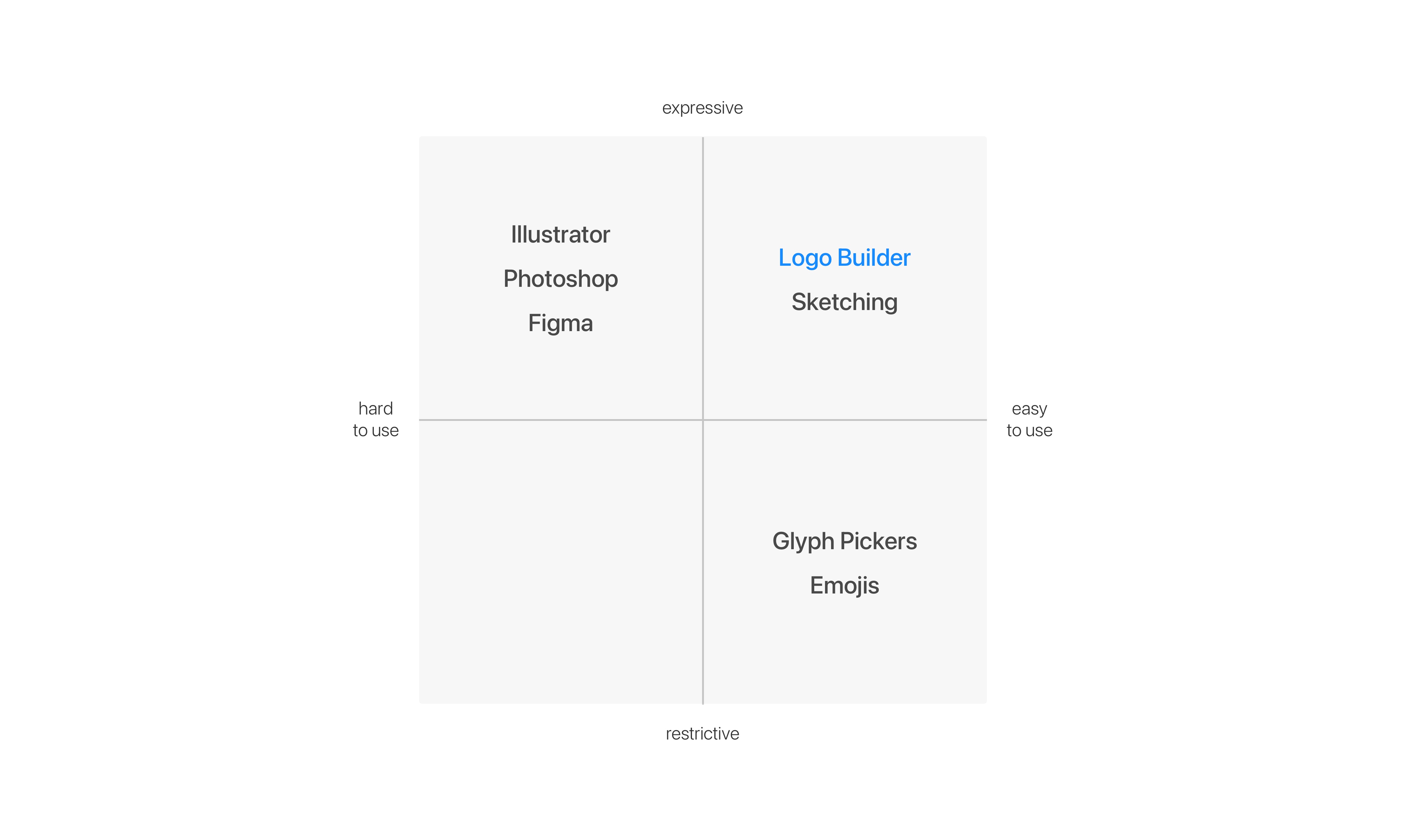
With traditional solutions to this issue, there’s a tradeoff between straightforwardness and expression. While it’s certainly easy to pick from a list of glyphs, you can't get the kind of flexibility that’s possible with professional vector design software, yet that software is not accessible to everyone. My design had to enable the best of both, incredible ease of use while allowing for varied expression.
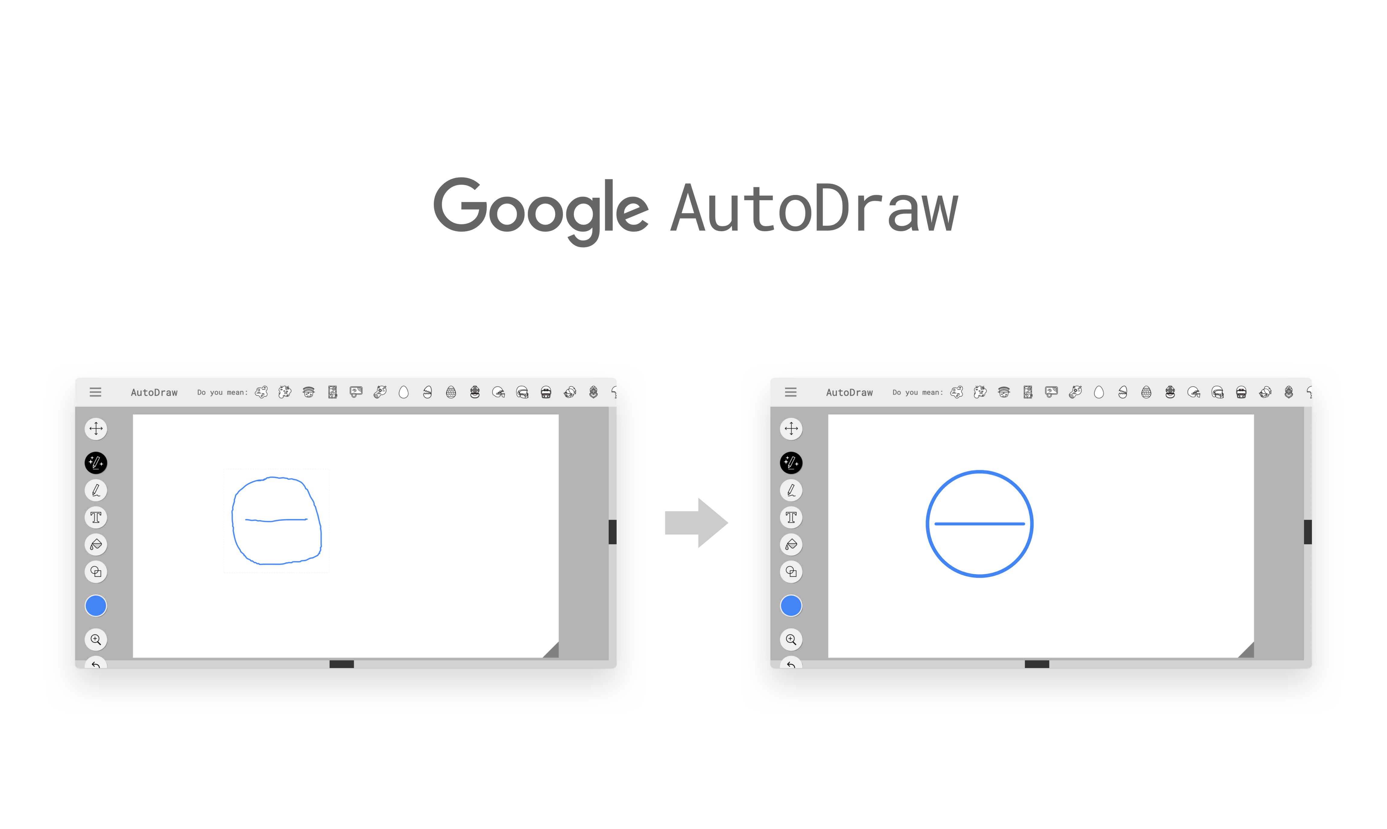
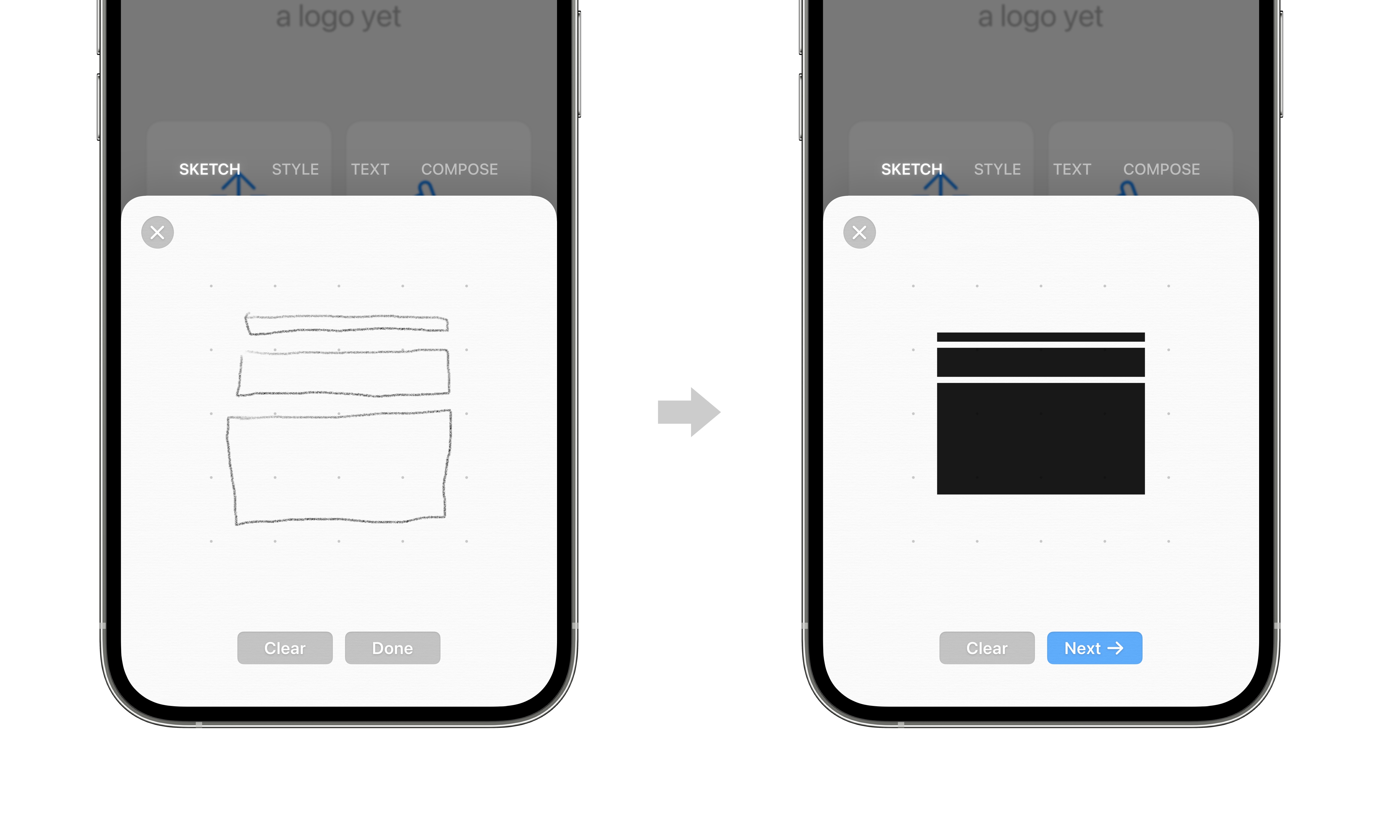
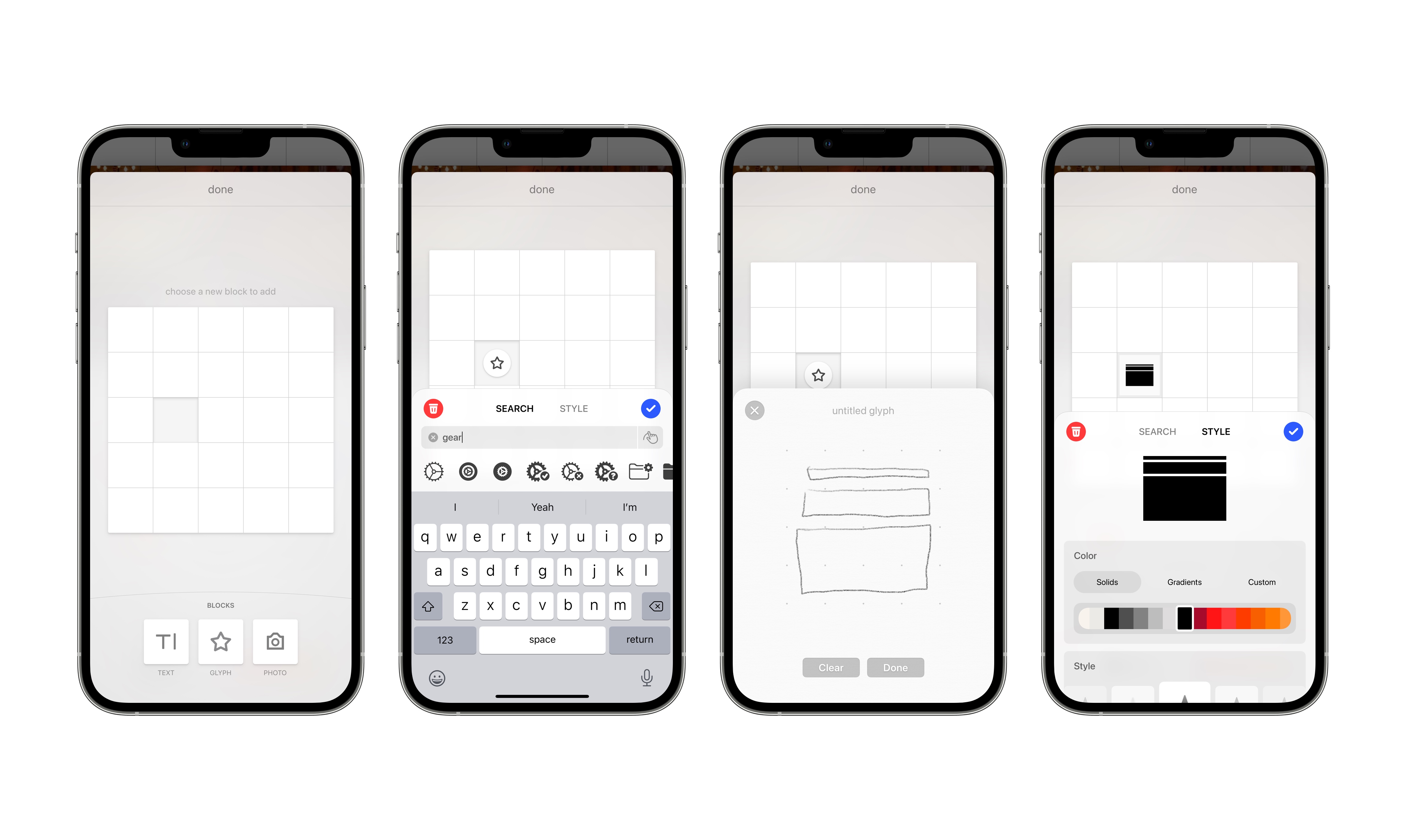
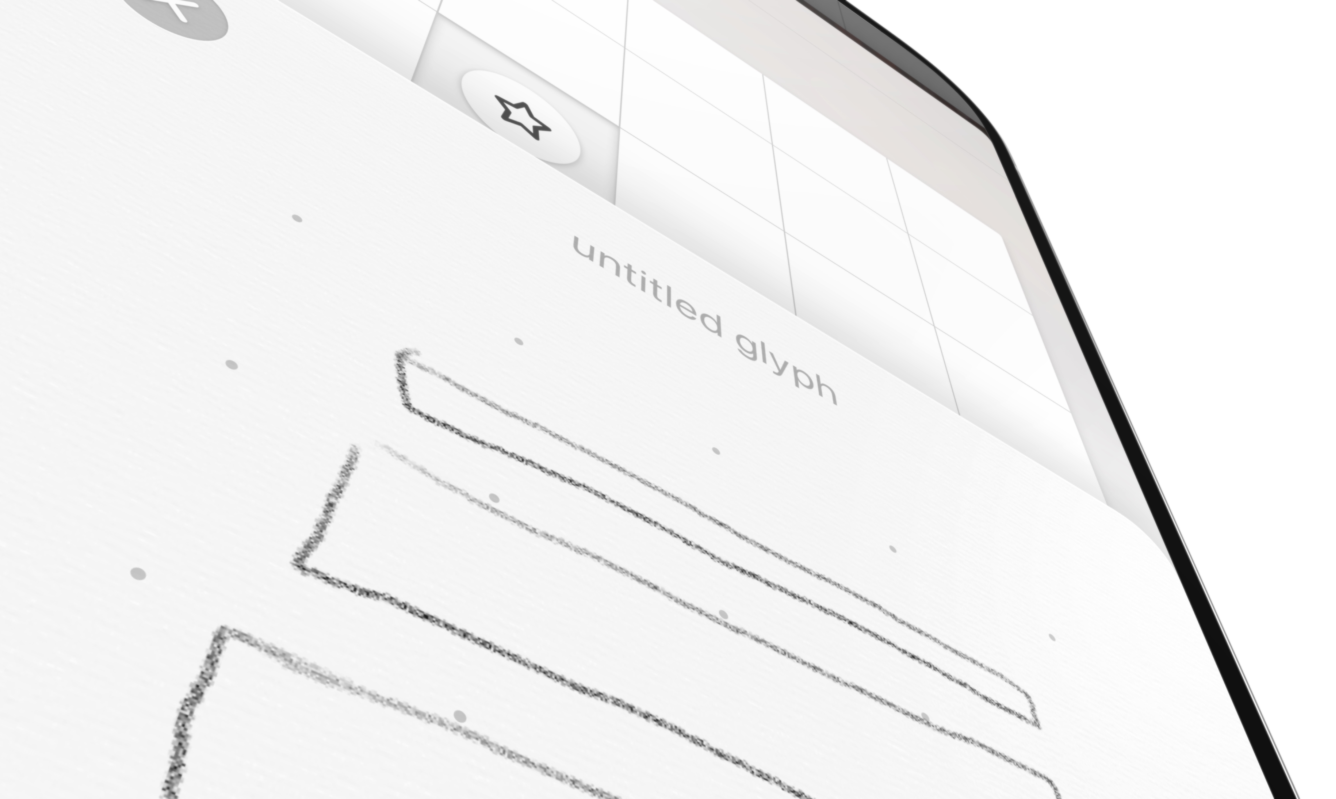
Sketching is something that we all do, whether it’s doodling in a notebook when you’re bored or making a quick diagram on the back of a napkin. This kind of rapid drawing is less about refined visuals than it is about quick expression. The idea became obvious—a quick sketch made with just your finger is transformed into a polished glyph, which you can then style and align with text. I had heard about deep learning models, like Google’s AutoDraw, which convert your brush strokes into a clean vector glyph. It was the perfect technology for this problem.
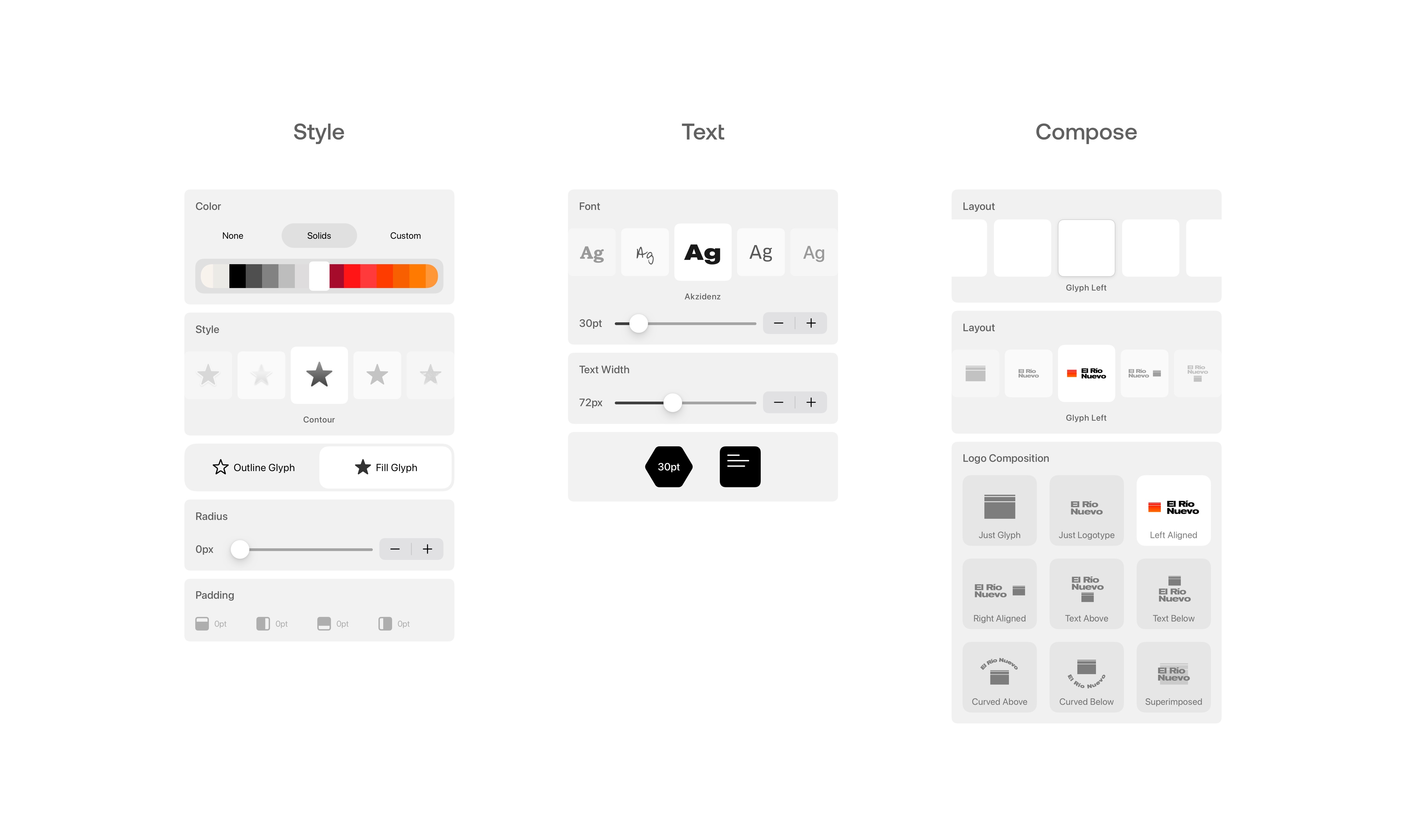
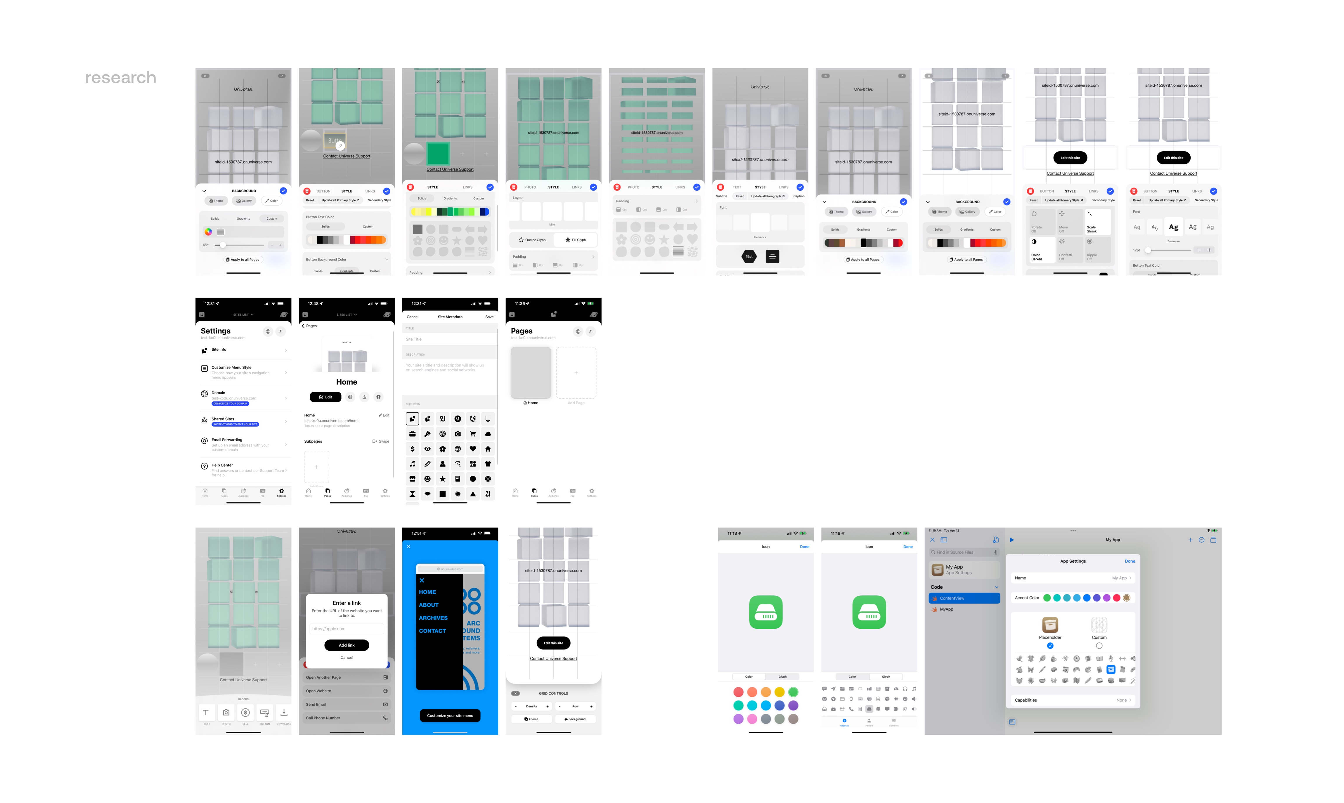
The next step was creating an interface which communicated the four steps of this process clearly to the user—sketching, styling, text, and composition. Through lots of iteration, I found the right balance between simplicity and affordance. I carefully studied the existing Universe design system, and drew the specific palettes I needed to make my feature work.
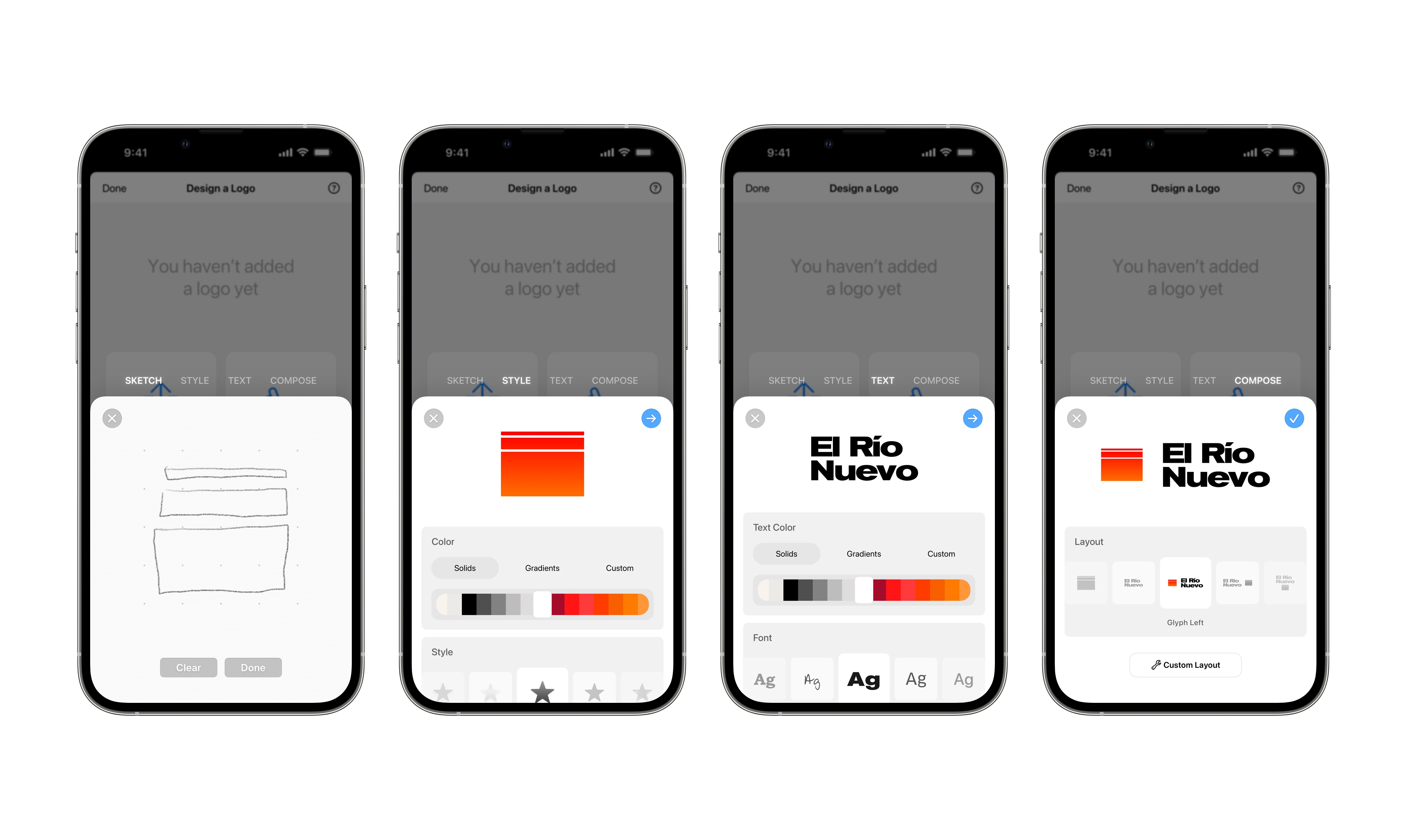
My first take leaned heavily on the “four step” model I described above. It was more like a logo wizard than anything else. By studying the design system closely, I was able to build a feature that fits with the feel of the existing interface perfectly, while also introducing some new delightful elements, like the glowing tab labels.
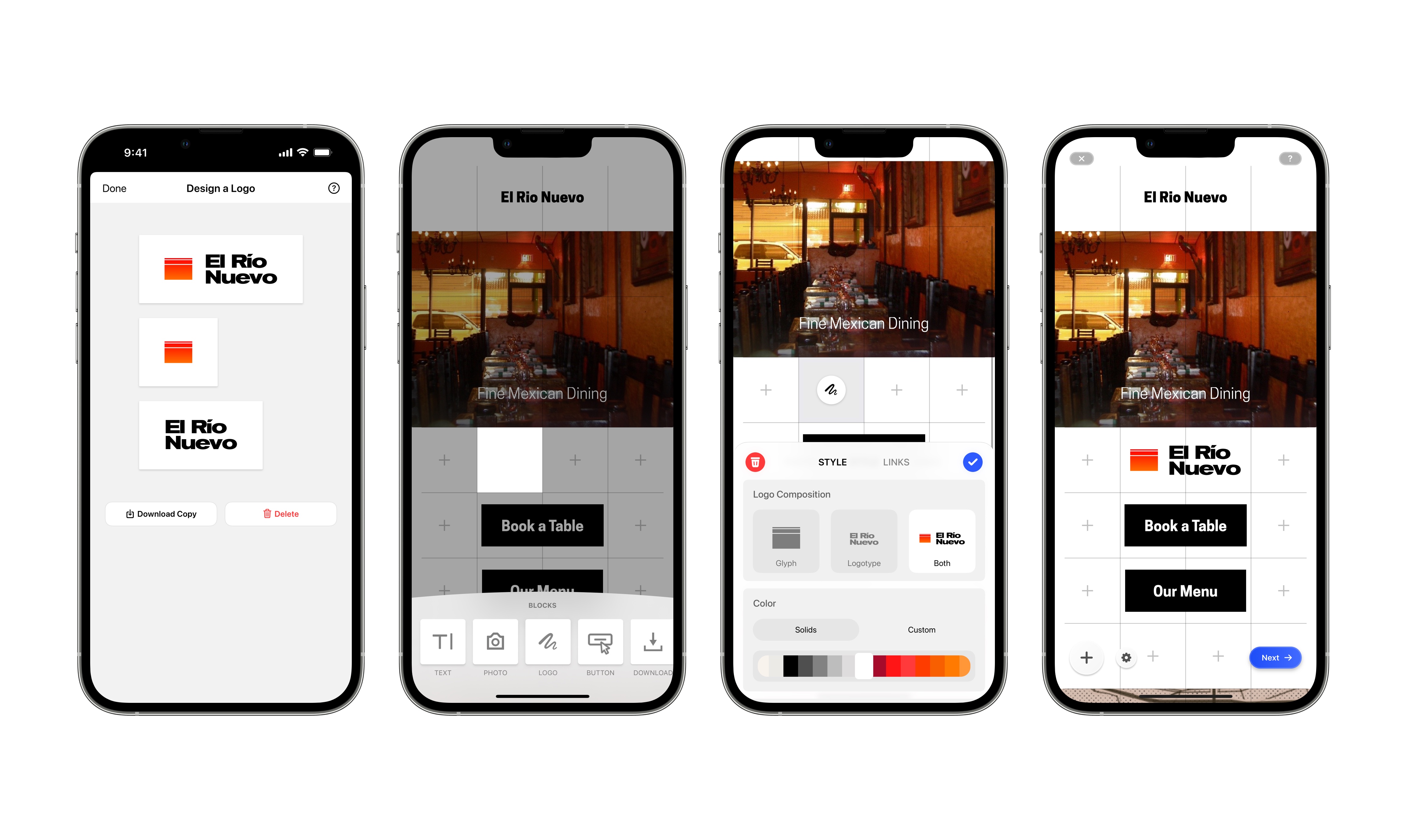
But unfortunately, I overlooked something crucial: design is never a linear process. The version I built locks the user into that four step process, making it cumbersome to move between the different elements. Further, it didn’t allow for more varied kinds of logos, say ones with two glyphs or just with two text laters. It’s ironic I made this oversight while working in my decidedly nonlinear process, but after talking with another designer at Universe, the solution to this problem became clear: take inspiration from the existing “grid editor” used in the rest of the app.
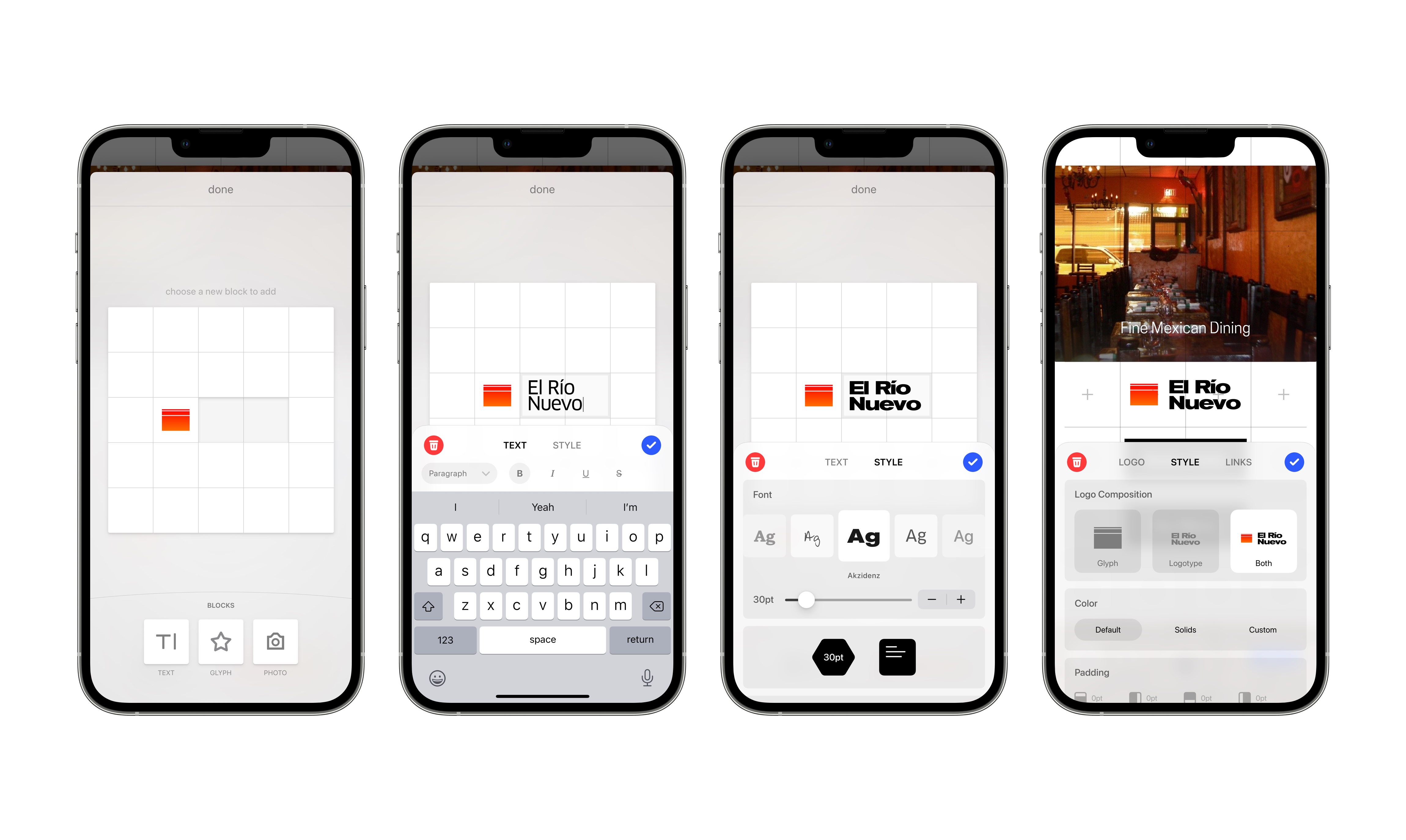
After entering the grid, which zooms onto screen from its associated palette, the connection between the Logo Builder and the rest of the app is clear. A more curated set of tools sit at the bottom of the screen, just the ones needed to build compelling logos. You can drag and size them anywhere on the grid, and jump between editing different elements and previewing them seamlessly. I kept features from my previous design, like Smart Sketch, but integrated it with a new glyph picker and search tool.
I’m incredibly grateful for the experience I had, and the things I learned while working with the team at Universe. I never understood just how different the mindset is that’s required when you make a tool to facilitate creativity. Most of the products I’ve designed before facilitate a singular best way to accomplish something, but with Logo Builder, I had to allow for the same kind of creative freedom I expect from the tools I use for my own work. Universe taught me a new paradigm of design.