Tally Reporter
A simple way to ensure election integrity everywhere.
client
Voatz
role
UI designer
timeline
2 weeks, 2021
tools
figma, sketch, origami
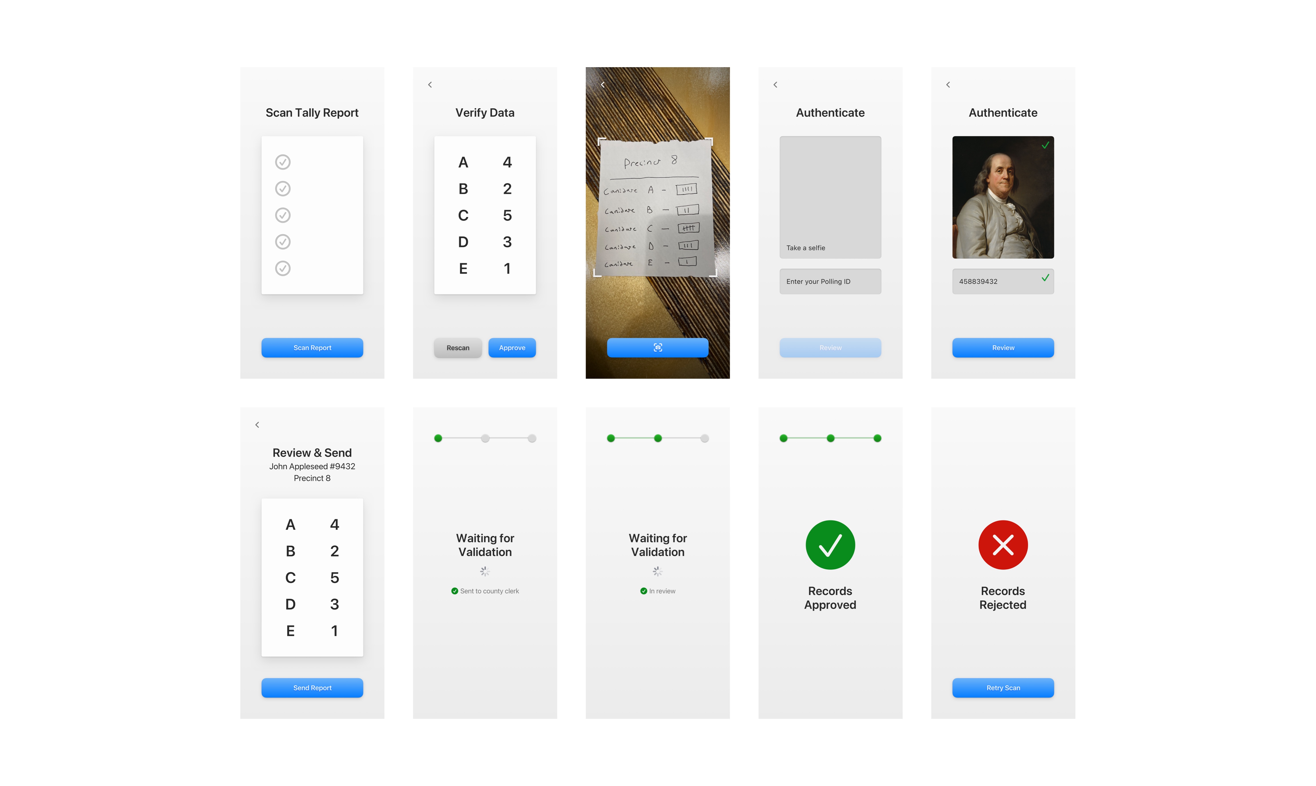
Elections are only a success if they are fair, and the only way to know that is to have a system of accountability in place. Early on during my time at Voatz, we began an exciting project—designing a system for "tally reporting", a way for polling places to send the number and kinds of ballots they processed to their parent districts, for further review. It was an ambitious project, but we didn't have much time. We had to have a production level demo ready to show to a state government in just two weeks. The quality of our demo would determine whether or not we’d get the contract.
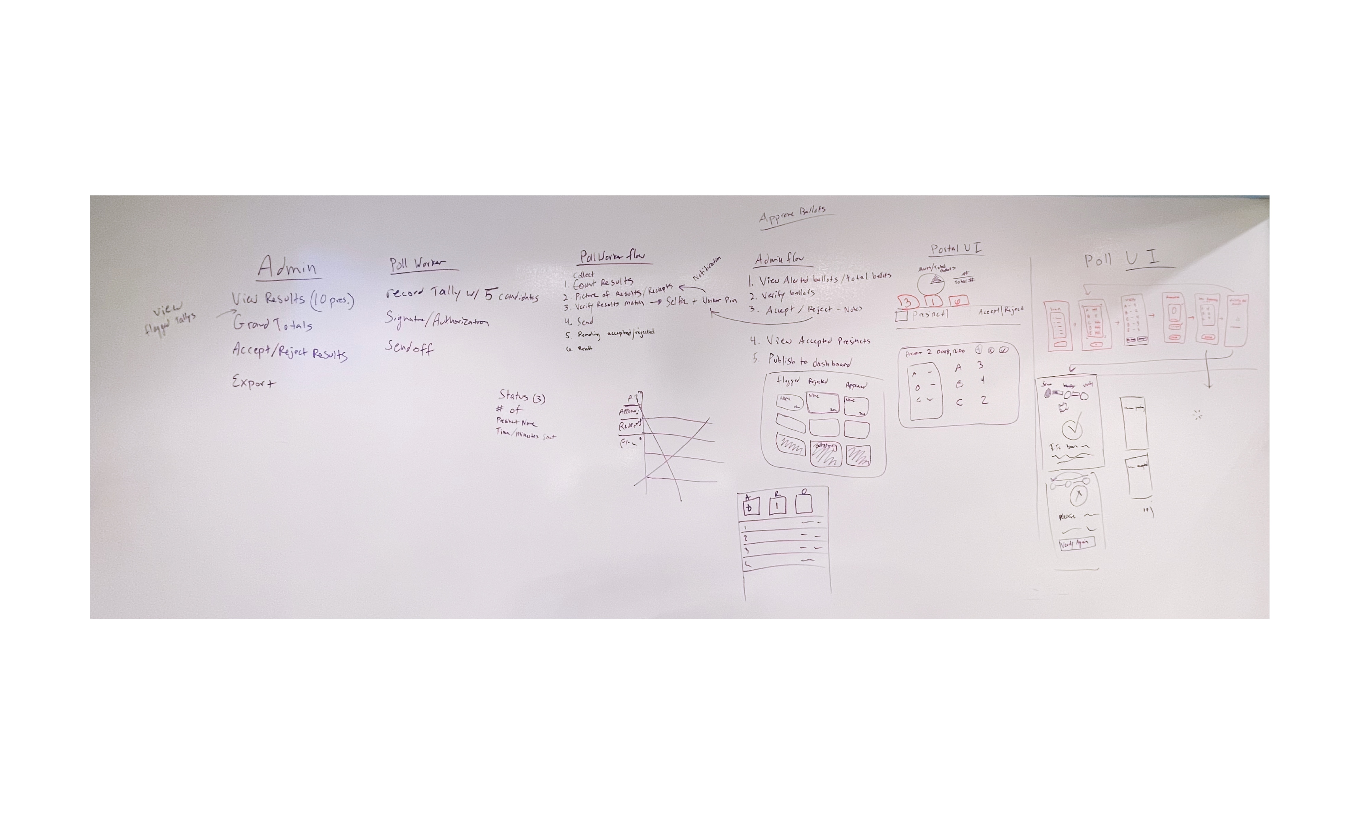
Even though the deadline on this project was tight, the direction we received was clear. I believe that one of the most important skills you can have as a designer is a well trained intuition—not just for what is aesthetically sensible, but what is intuitive and delightful. After brainstorming with the team, I began my process by expressing my vision through polished visuals. This first prototype was helpful in setting the visual tone of the entire project. While many of the design ideas didn’t make it to the final version, some aesthetic elements survived to the final demo.
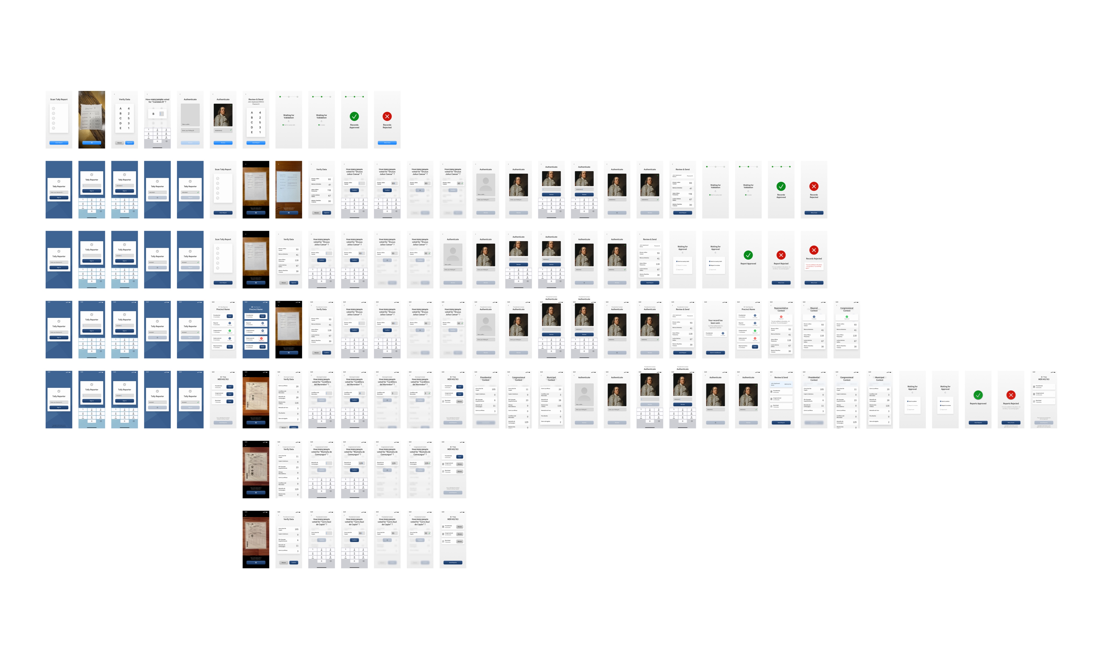
Further iteration continued to refine the idea by adapting the flow to better fit existing mental models our customers had, by integrating the brand aesthetic, and incorporating some clever status visualization features.
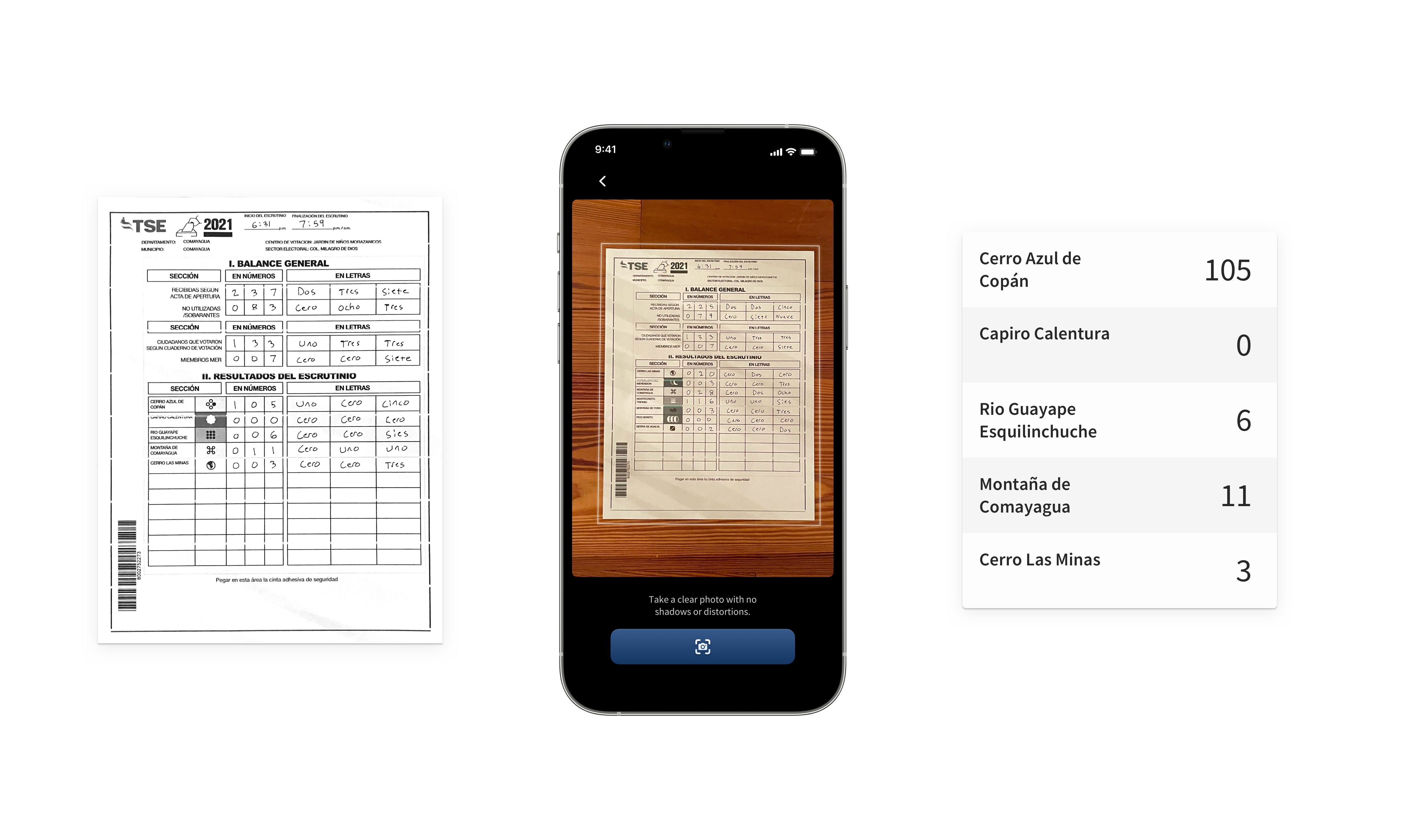
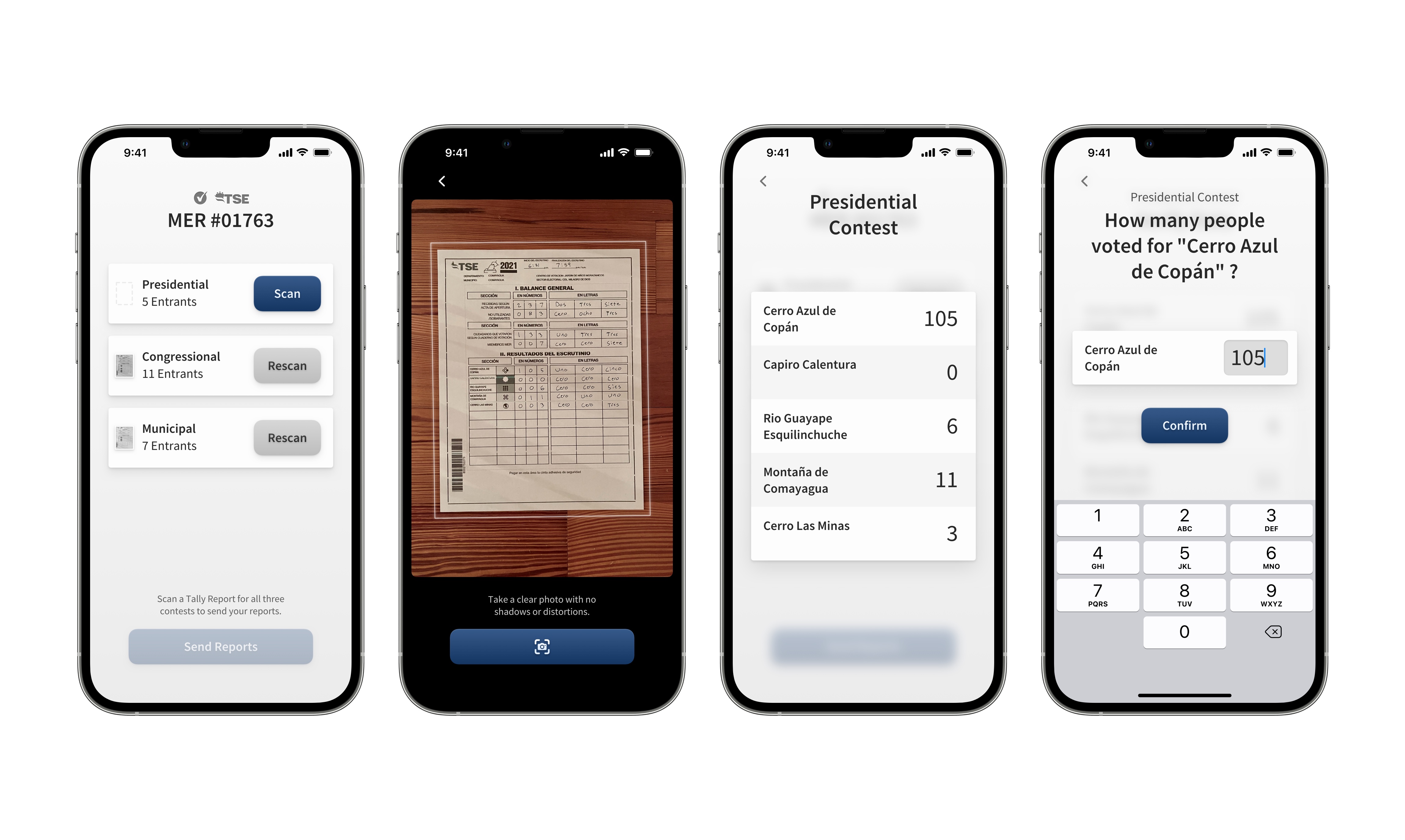
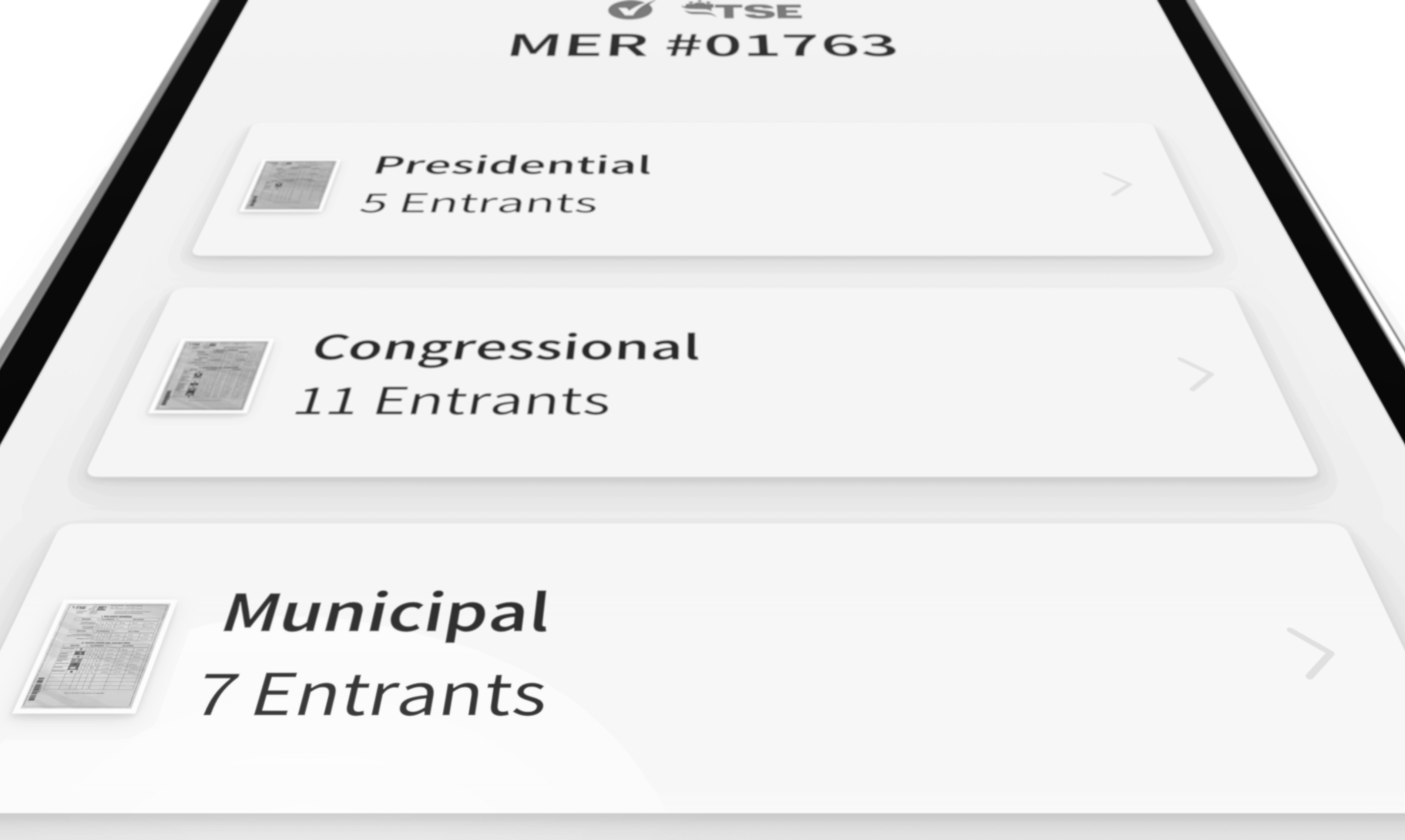
Because the goal of this project was a demo that could be shown to potential customers, I decided to add in some details to set ourselves apart from competitors. I recreated the official ballot sheets from the regions we were marketing to, so they could be "scanned in" during them demo. I also created a mock-election to run in the app, with political parties named after famous local natural landmarks.
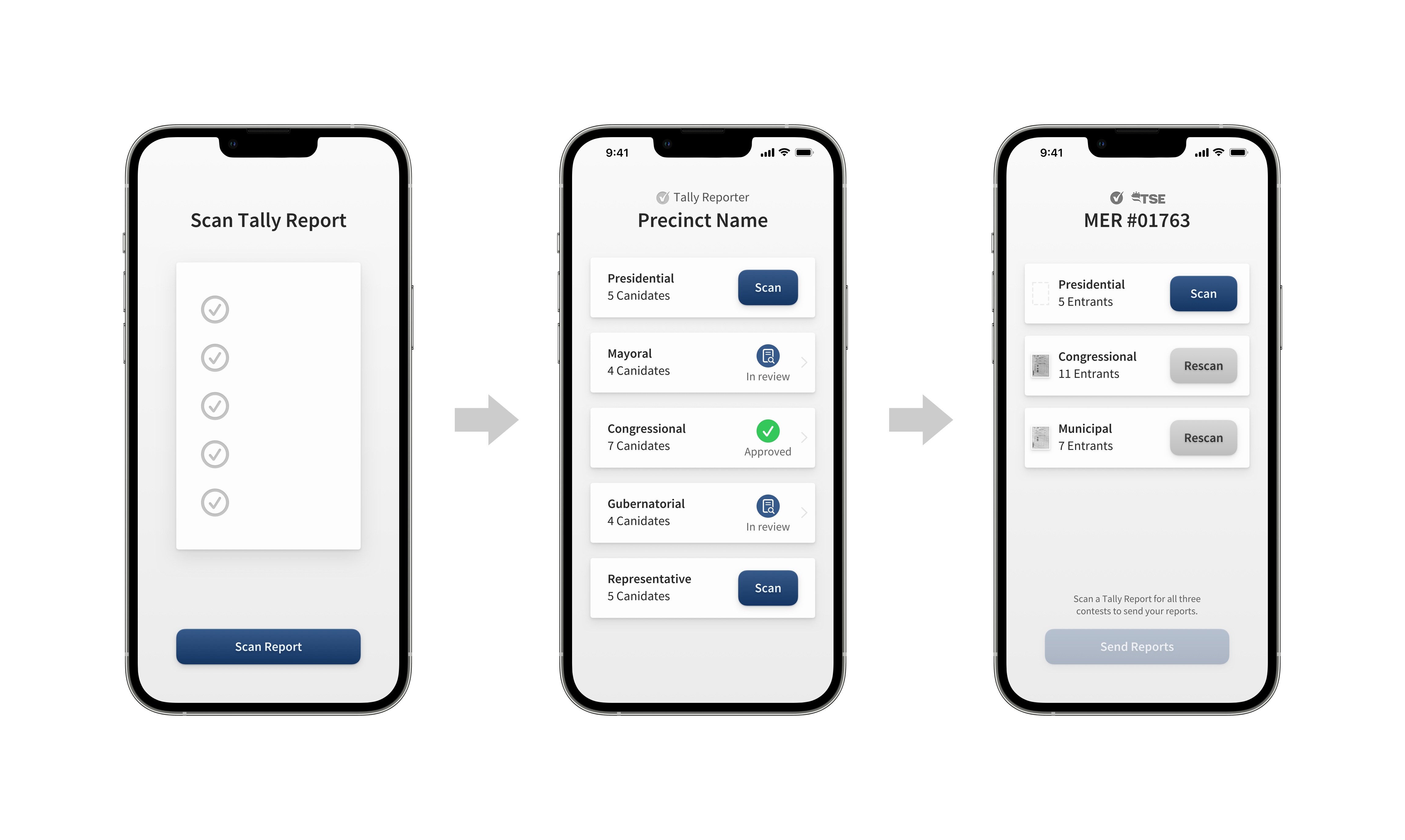
One of the largest problems we solved was our presentation of the scanning flow. The first designs were built around a linear model, but with more research we decided that it was essential to allow for asynchronous record scanning. This had positive ramifications throughout the product, an example being scan rejection. Now, if a specific scan is rejected, only that scan would be available to revise, with the rest of the submission disabled for editing.
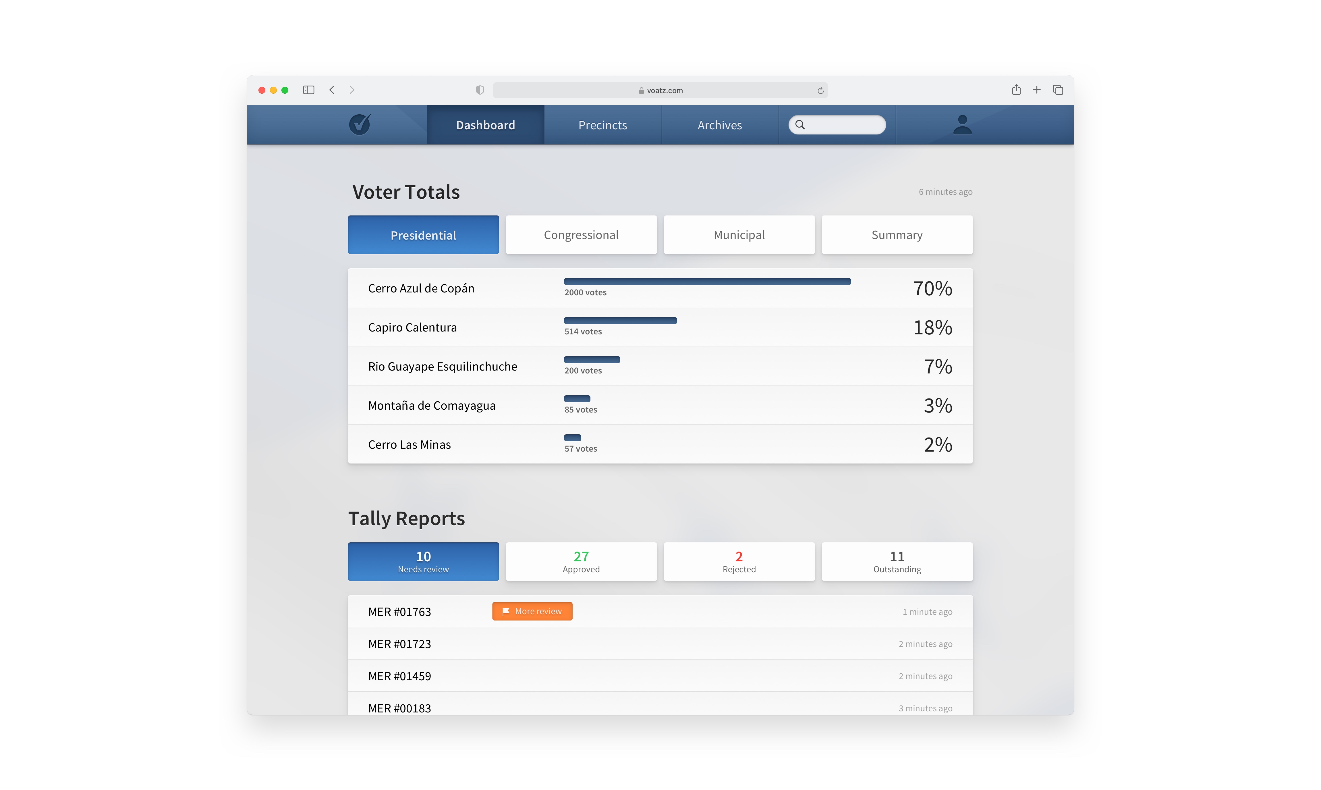
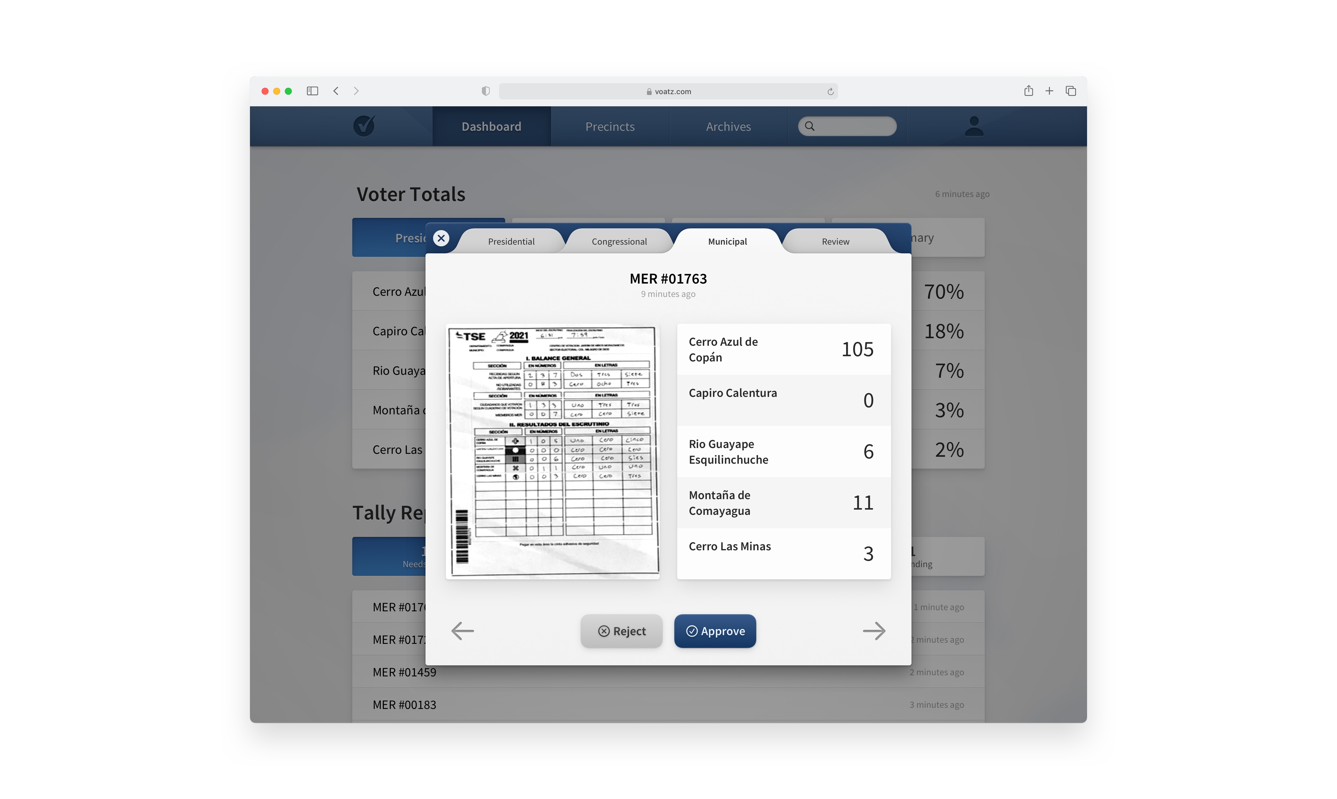
During the project, in parallel, we had been working on a desktop design to function as the place where all of these reports would be received and reviewed. It has the same clarity and lightness I worked to achieve in the mobile app, with some whimsical touches, like the tactile tabs in the report review screens.
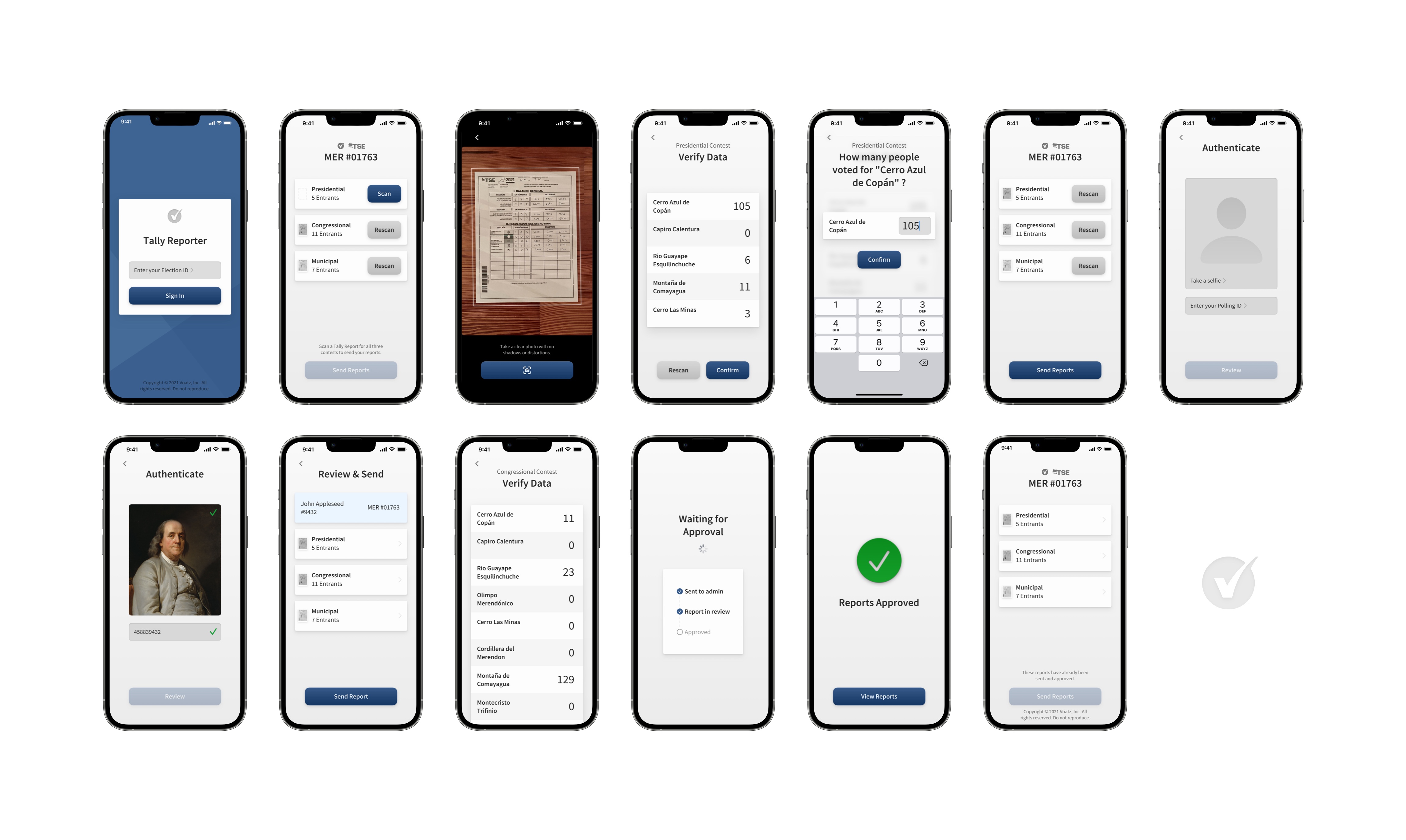
After we finalized our designs, I then animated a compelling interactive demo. I had been working on motion design during the entire process, so I worked in Figma to polish those ideas.
I’m very proud of the product we created, especially in just two weeks. Instead of cutting corners and making something as confusing and grating as conventional government software, Tally Reporter is delightfully light. That simplicity is a direct result of the work we did to distill the reporting process to its most elemental steps, and then express that philosophy in our visual language. Working on something with a tight deadline like this taught me what kinds of things to prioritize in my design approach, and how far I could push my self and still do great work.