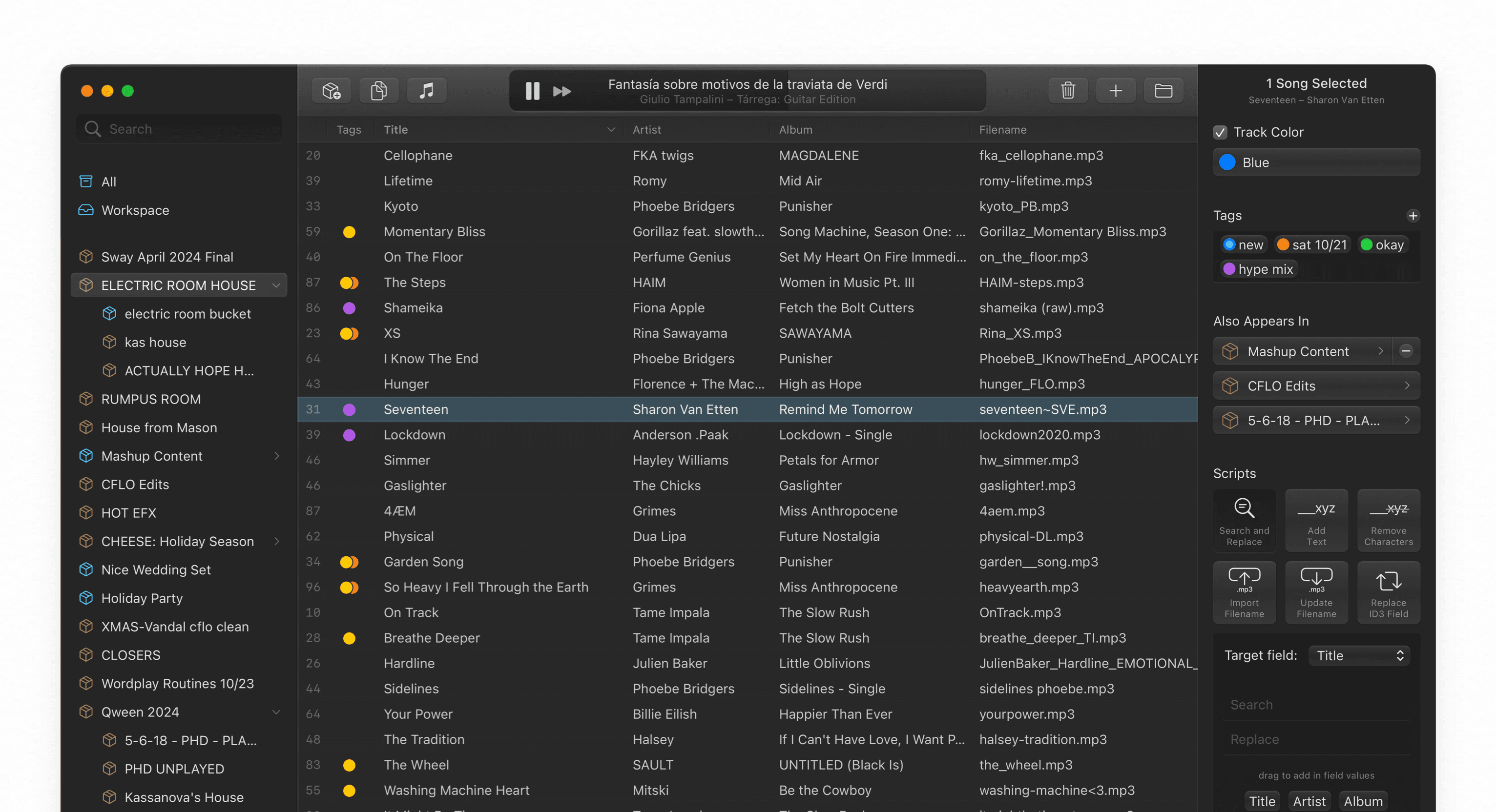
In 2023 and 2024, I worked at CFLO leading the design of Crativity, a powerful Mac app that lets DJs effortlessly manage their music libraries with innovative features. Crativity seamlessly integrates with Serato, the industry standard performance tool for DJs. With dozens of powerful tools, the interface I crafted empowers artists to take charge of their libraries.
I created a highly refined, comprehensive user interface for Crativity, engaged in thorough feature development informed by user feedback, collaborated closely with engineering, and wrote some custom components in SwiftUI. The result is an app that’s both easy to use and unlocks powerful new capabilities for artists.
Research
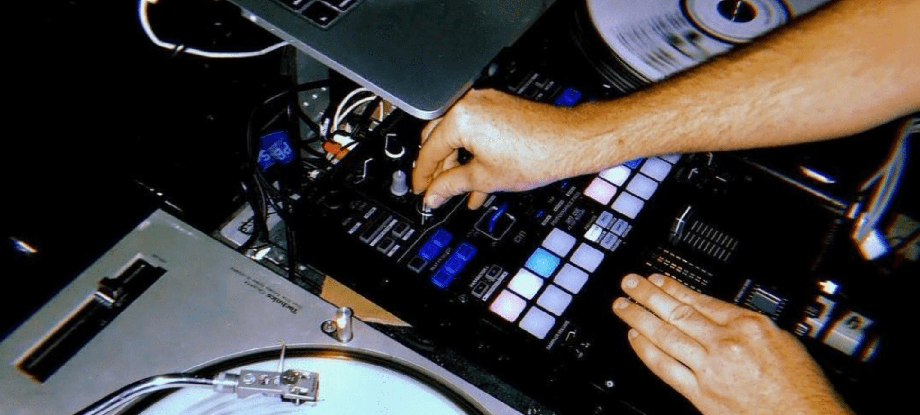
When most people think of DJs, they think of the booming beats, the excited crowds, the bright flashing lights. Most people don’t think of the controls:
But controls just like these define much of the complexity of a DJ’s job. Just as there are numerous physical controls at a DJ’s fingertips, there are many software controls, too.
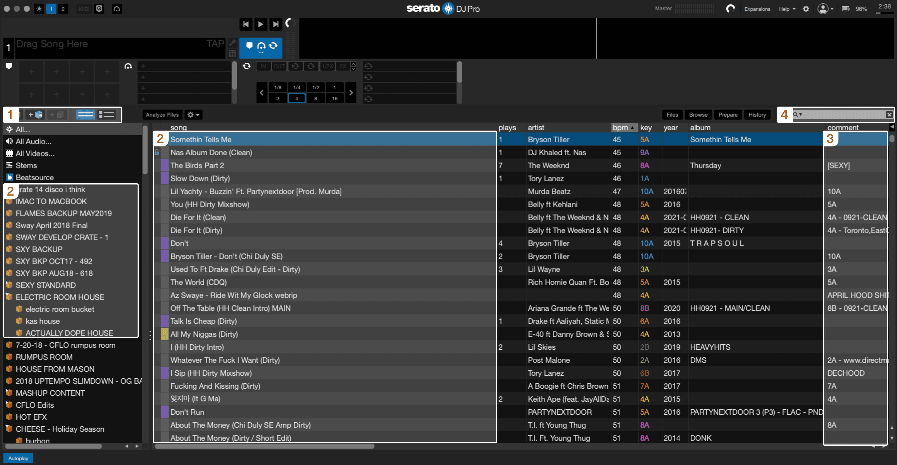
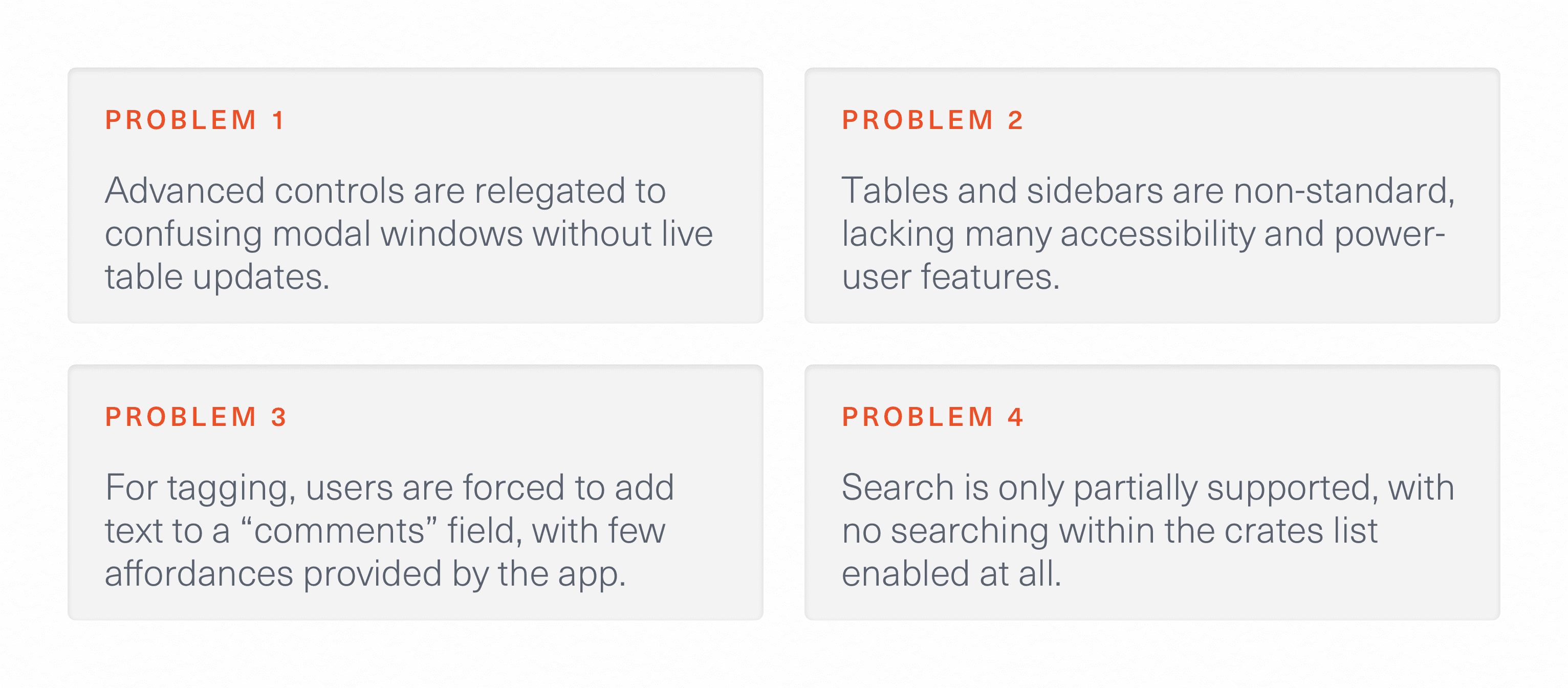
The industry standard for DJ software is Serato. Being a cross-platform app, Serato suffers from serious usability issues when it comes to managing large libraries of tracks. Common operations like browsing, search, and tagging are inconsistent and difficult to access.
DJs have a unique challenge. Unlike an everyday person with only a few thousand songs in their music library, DJs keep hundreds of thousands of songs in their ever-growing libraries. They keep dozens of different versions of the same song, a remix here, an vocals-only track there. These extensive libraries are critical for the kinds of creative performances the very best DJs love to give.
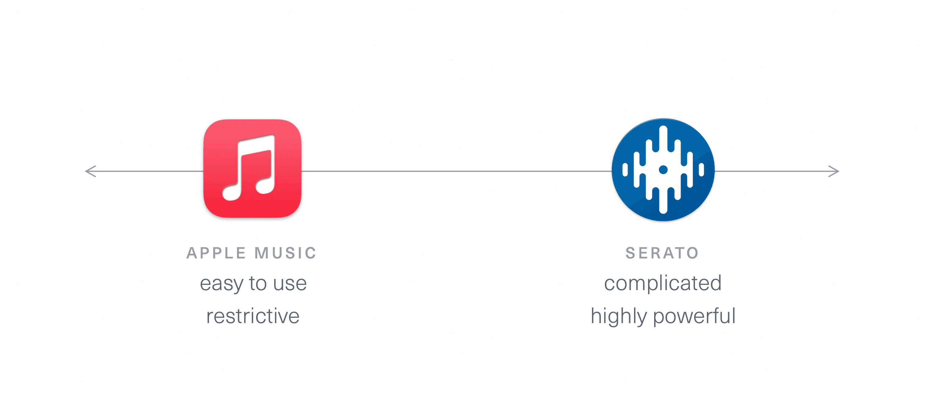
Library management software is what empowers DJs to sift through and organize their vast libraries—its akin to a photographer’s ability to browse hundreds of photographs from a shoot. We can imagine library software as existing on a scale:
Serato provides immense power and flexibility—everyone’s workflow is accommodated, at the cost of daunting interfaces. Whereas apps like Apple Music and Spotify are far easier to use but limit users to a single path—something not suitable for a pro tool. With Crativity, we set out to create an app that had the ease-of-use of an app like Music, but with even more power than Serato. Tall order.
Organizing Complexity
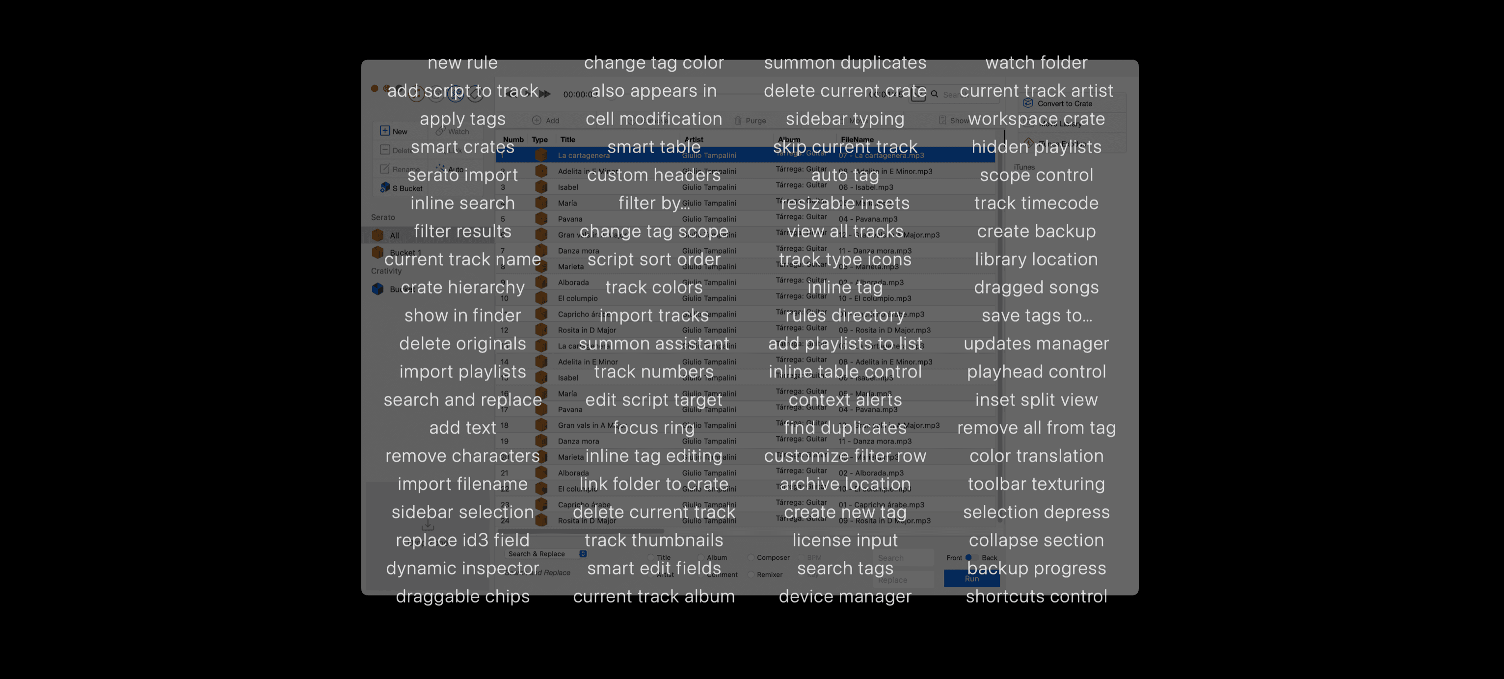
The key to achieving a powerful, yet intuitive design lies in effectively organizing the many, many disparate features that a pro app like Crativity has to have. I began by enumerating, then categorizing these features.
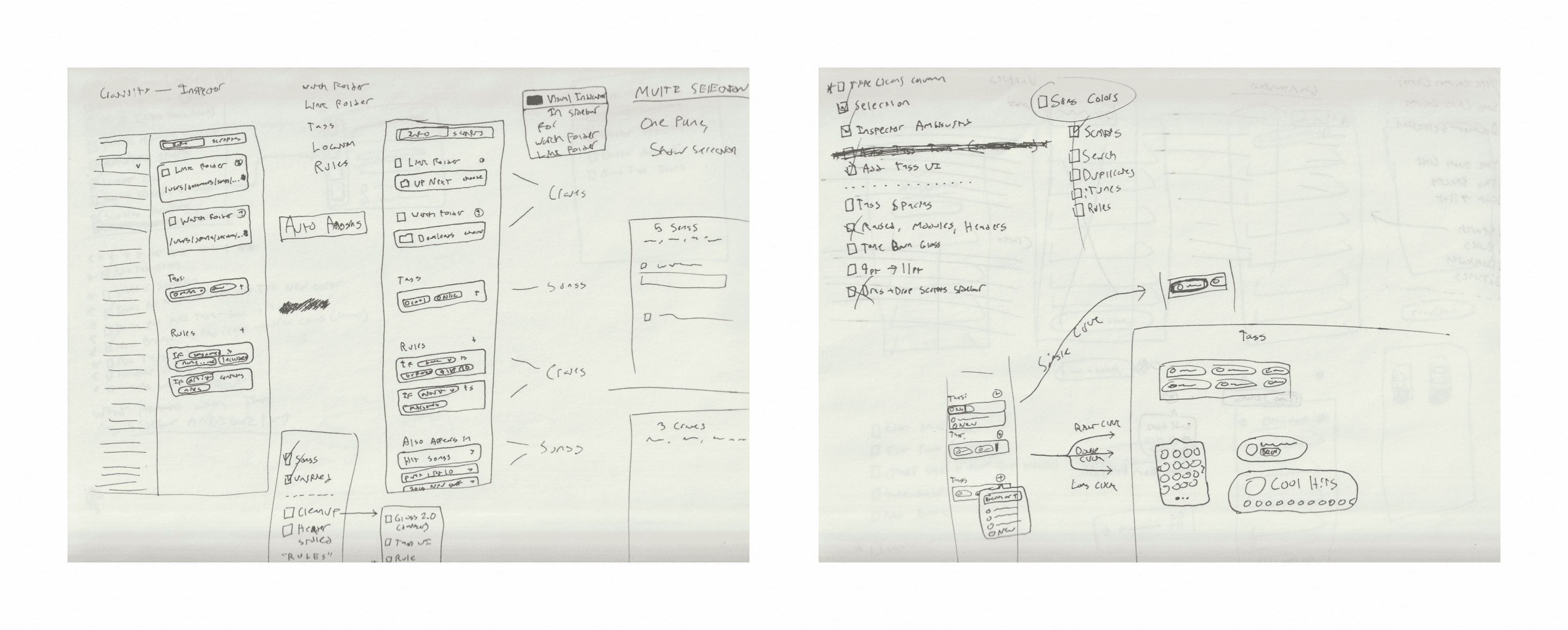
Through wireframing, sketching, and prototyping I refined every workflow in the app.
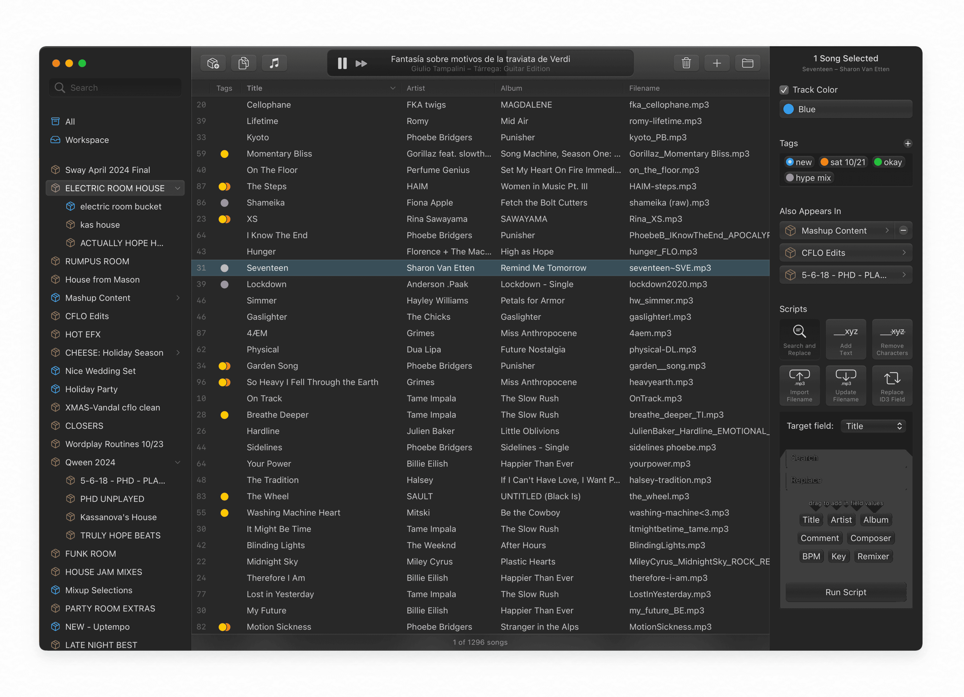
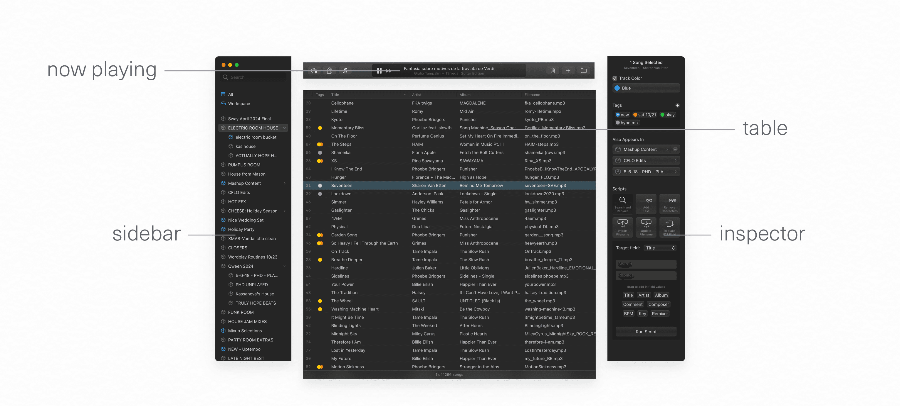
This research led me to organizing the app into four distinct functional regions.
This strong hierarchy I developed was key to the resulting interface’s sense of calm—Crativity feels refreshing compared to the frenetic, confusing software artists are often confronted with.
Seamless Integration
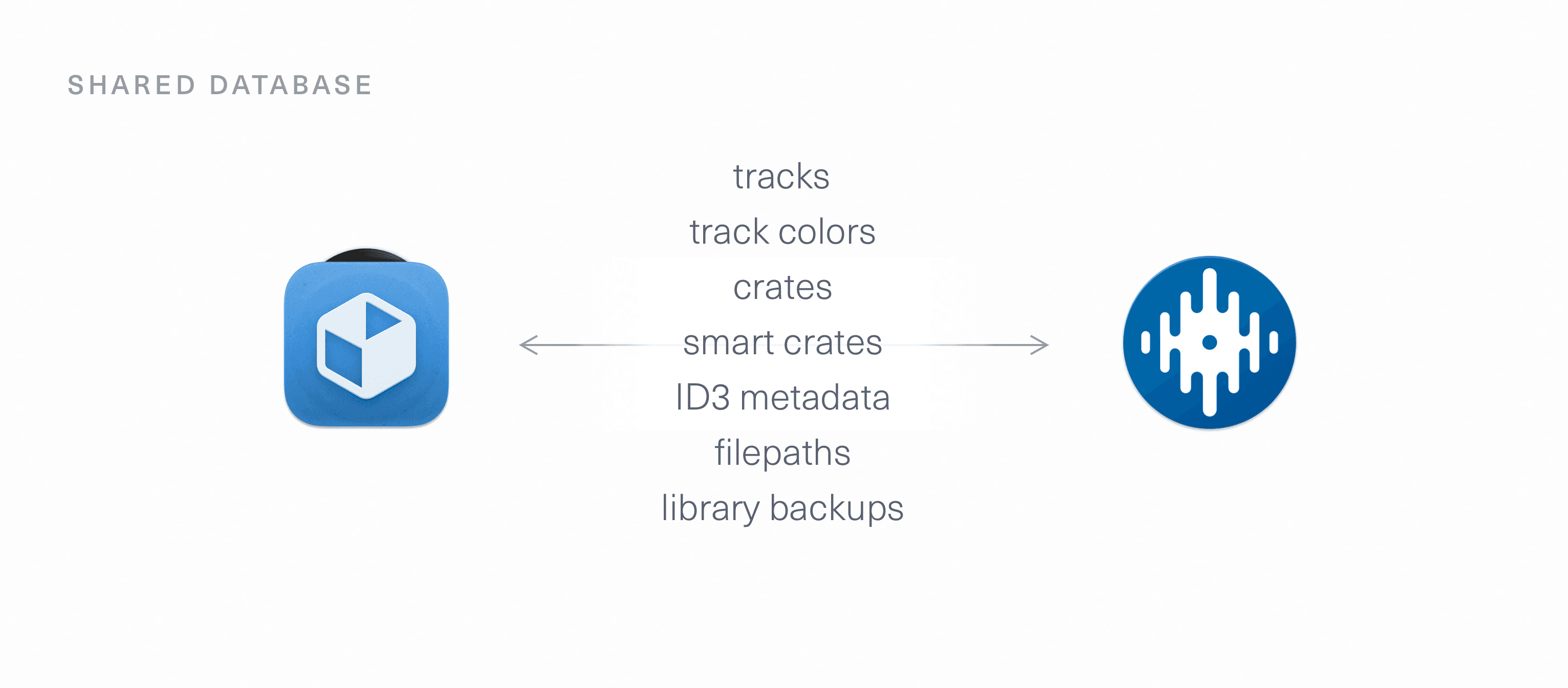
Crativity, with a far more powerful features for managing libraries, was designed from the ground up to integrate seamlessly with Serato—it edits the very same library database. Changes in one app are perfectly reflected in the other:
I knew that success would depend on more than just technical compatibility. For users to find Crativity approchable metaphorical compatibility with Serato was crucial. I designed numerous details in the app to embody this:
Track Colors & Icons
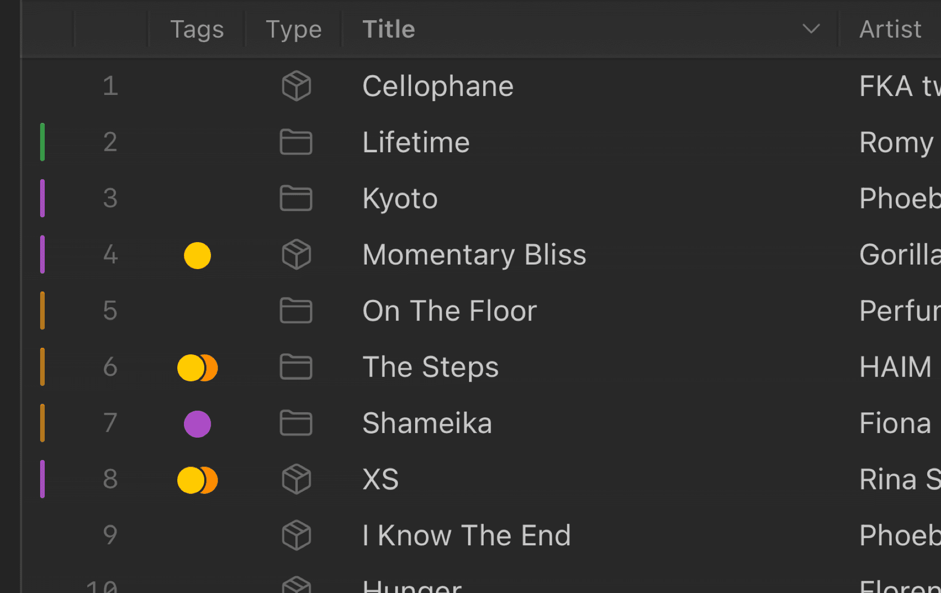
Serato mainstays, like file type icons, track numbers, and track colors are all preserved—and enhanced—in Crativity. Users can heavily customize the table, picking which columns and headers they’d like to see.
Color Pickers
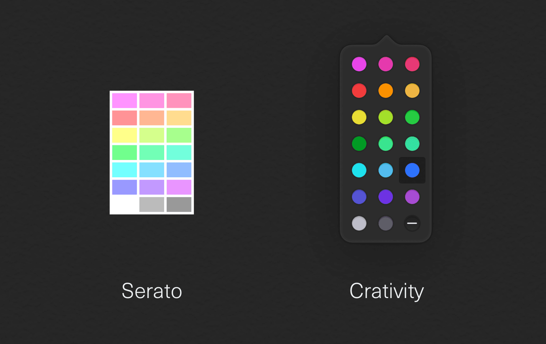
I reimagined the 21-color Serato palette in Crativity. The orignal Serato colors were low contrast and muddy. I created a vibrant set of new hues that map perfectly to the original ones in Serato—color pickers are even ordered in the same way, keeping users’ muscle memory intact.
Unified Smart Crates
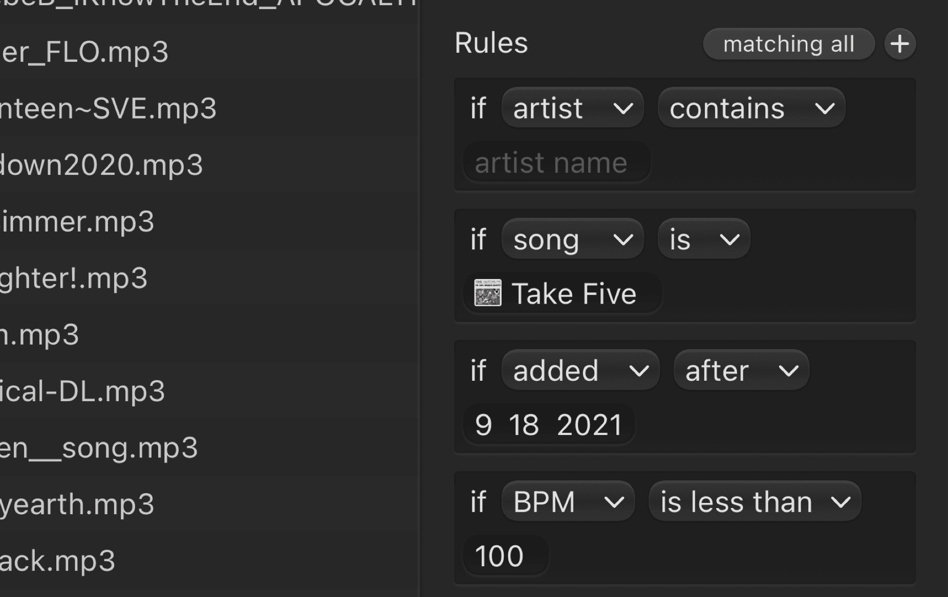
Smart Crates have their contents determined by rules. Crativity adds new rules for users to pick from. I knew the obvious solution—keeping Serato smart crates distinct from the more powerful ones in Crativity—would be a mistake. I devised a new way to encode Crativity’s rules right in the track metadata without breaking compatibility with Serato.
A New Visual Language
From the very beginning, the team knew we wanted Crativity to be a first-class Mac app—that means hitting a very high bar for visual design. I created an entirely new, yet accessible visual language for Crativity. It expresses a unique character that encourages people to use the app.
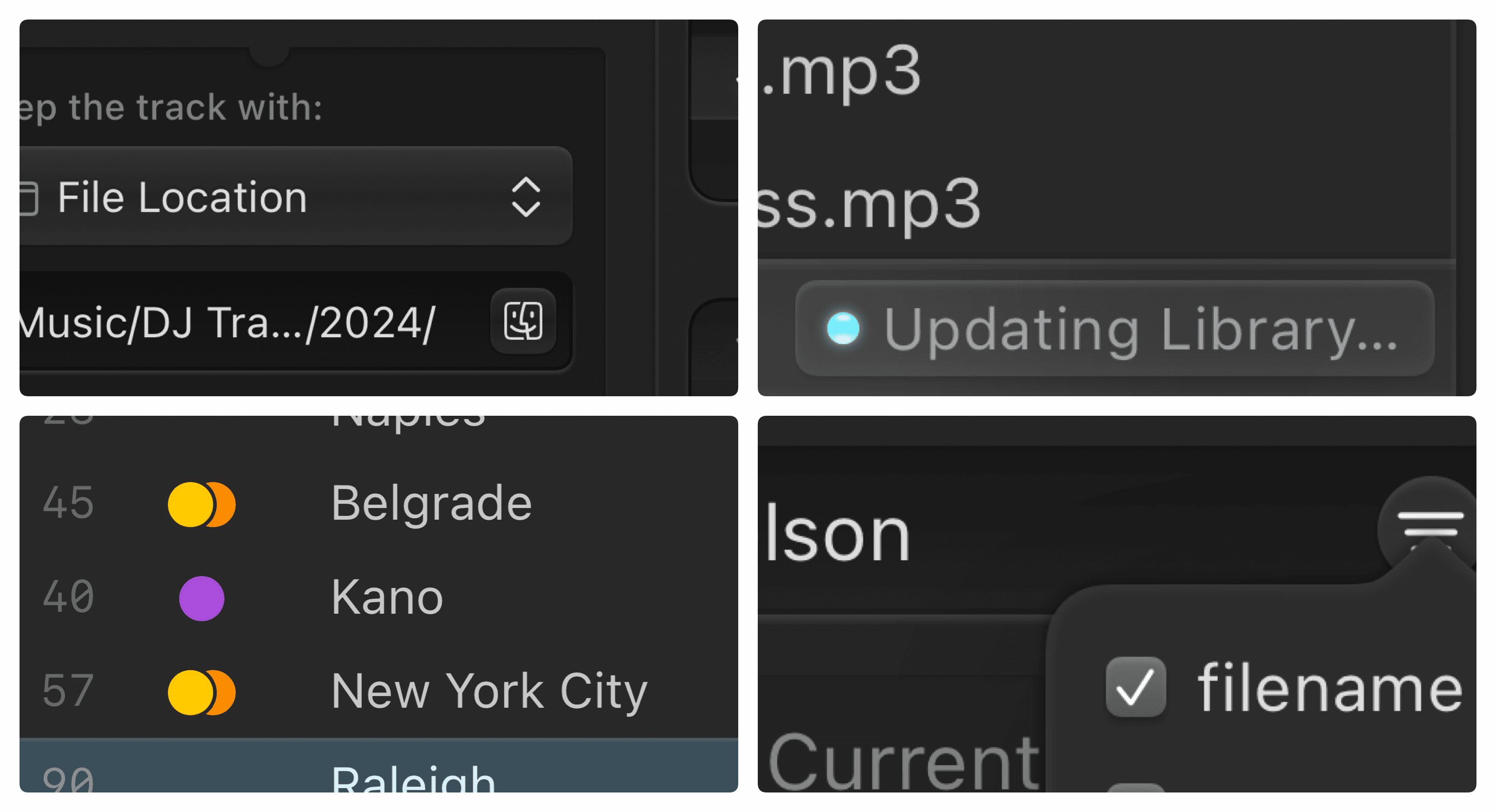
I ensured that every control, every surface in the app was carefully crafted. Active elements in Crativity have a subtle glossy look, that clearly communicates interactivity without being distracting.
Windows and larger surfaces have subtle highlights and refractions, reflective of the physical metaphor I kept in mind throughout the design process.
While this dimensional appearance is unique, the metrics and proportions feel right at home on the Mac. Crativity blends in seamlessly with other professional calibre Mac apps.
Dynamic Inspector
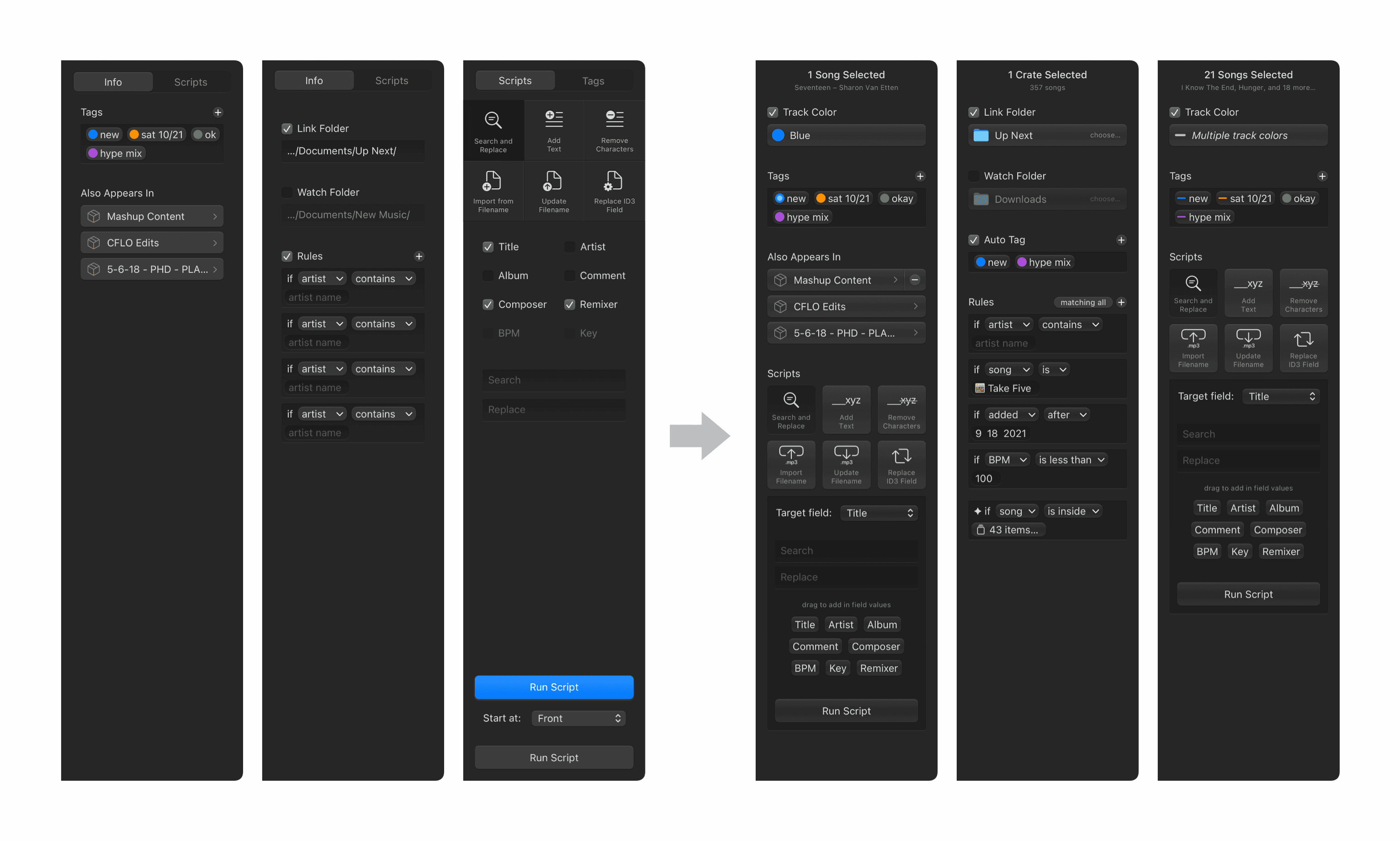
In Crativity, users manage two kinds of data, songs and crates. Access to different options are key for managing different kinds of data. Expanding on a common Mac paradigm, Crativity features a dynamic inspector that shows just the right controls, at just the right times.
I evolved the design from a tabbed inspector, with multiple views for different operations, to a dynamic layout that clearly presents the organization tools appropriate to the current context.
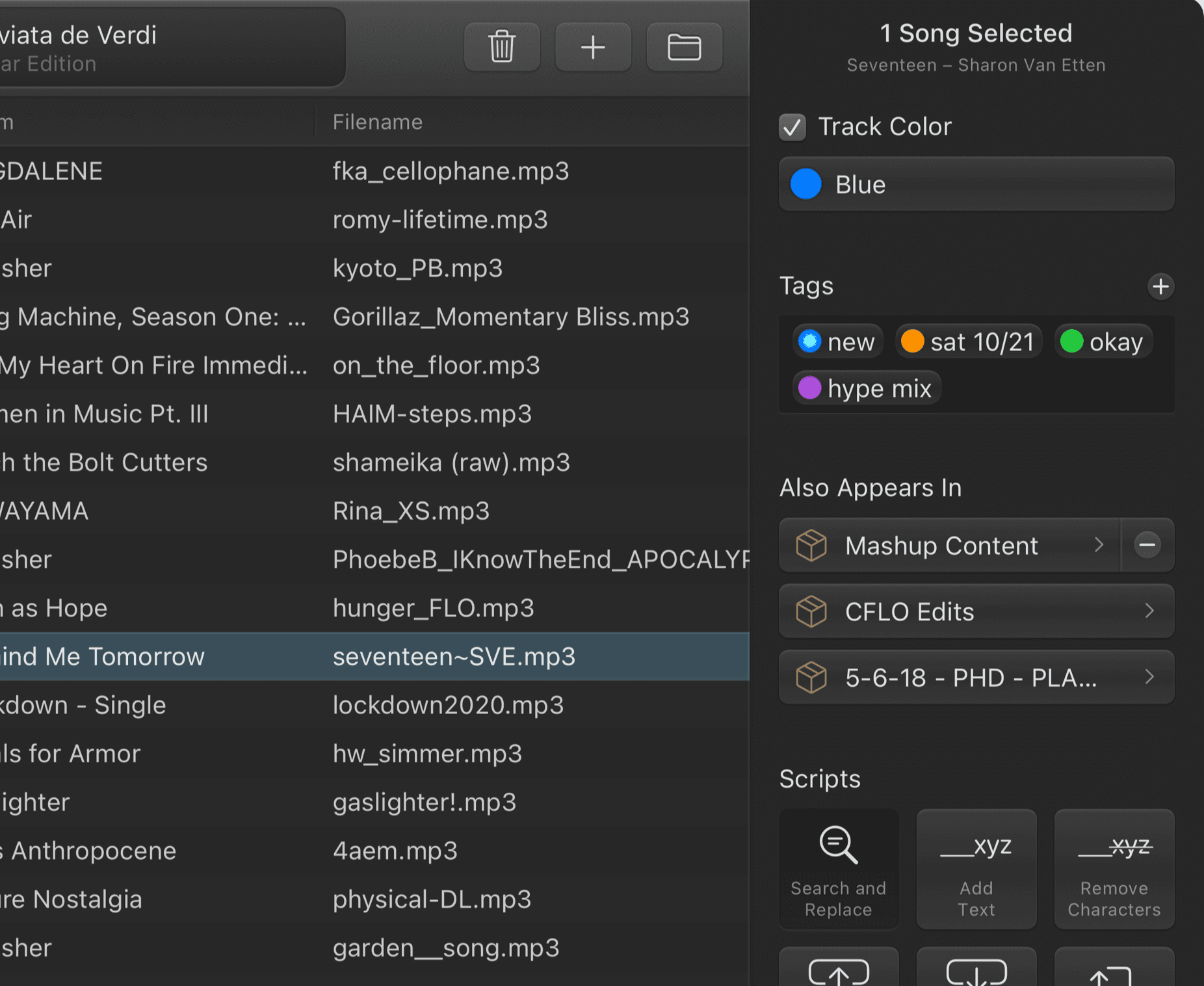
Song Inspector
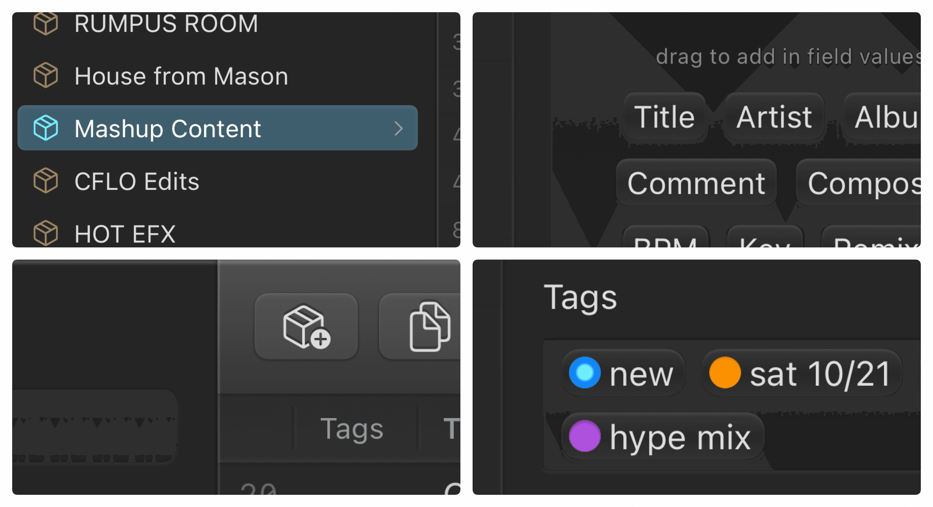
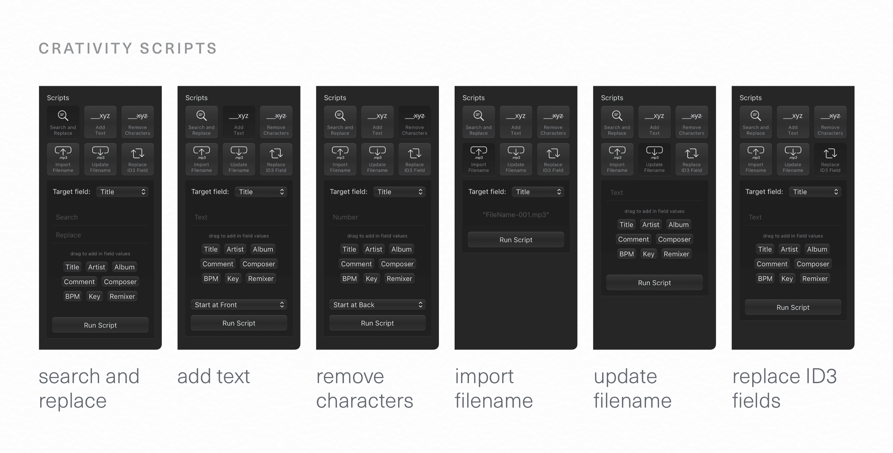
When songs are selected, the inspector lets users easily edit and create tags, view crate membership, and set a Track Color. It’s easy to apply powerful scripts that can be fine-tuned and saved. The modular interface I designed keeps the inspector concise and clear, while revealing tools far more capable than what’s in Serato.
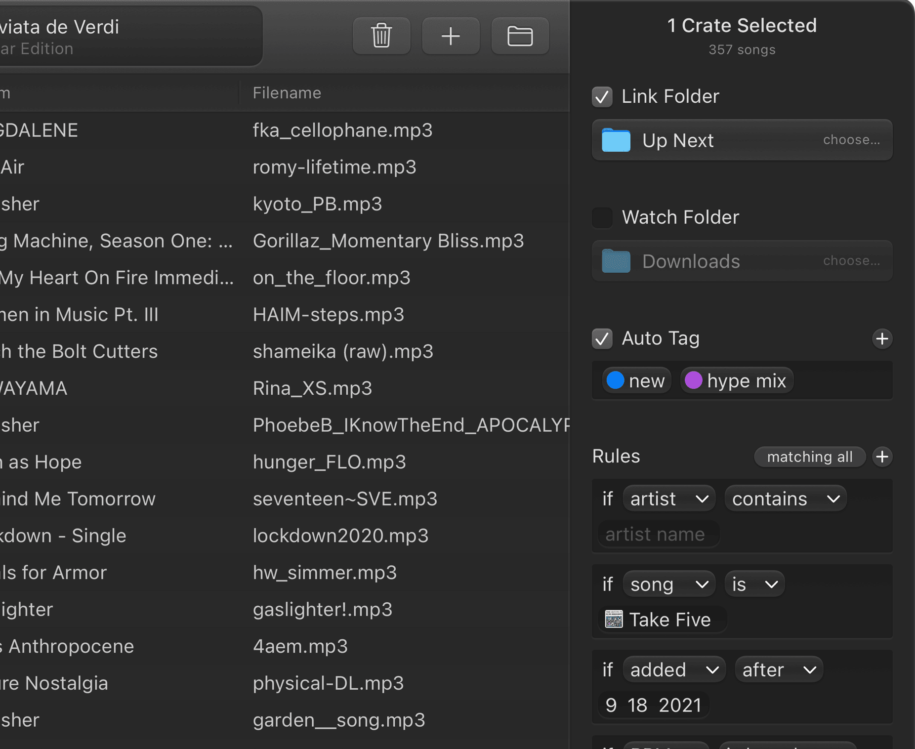
Crate Inspector
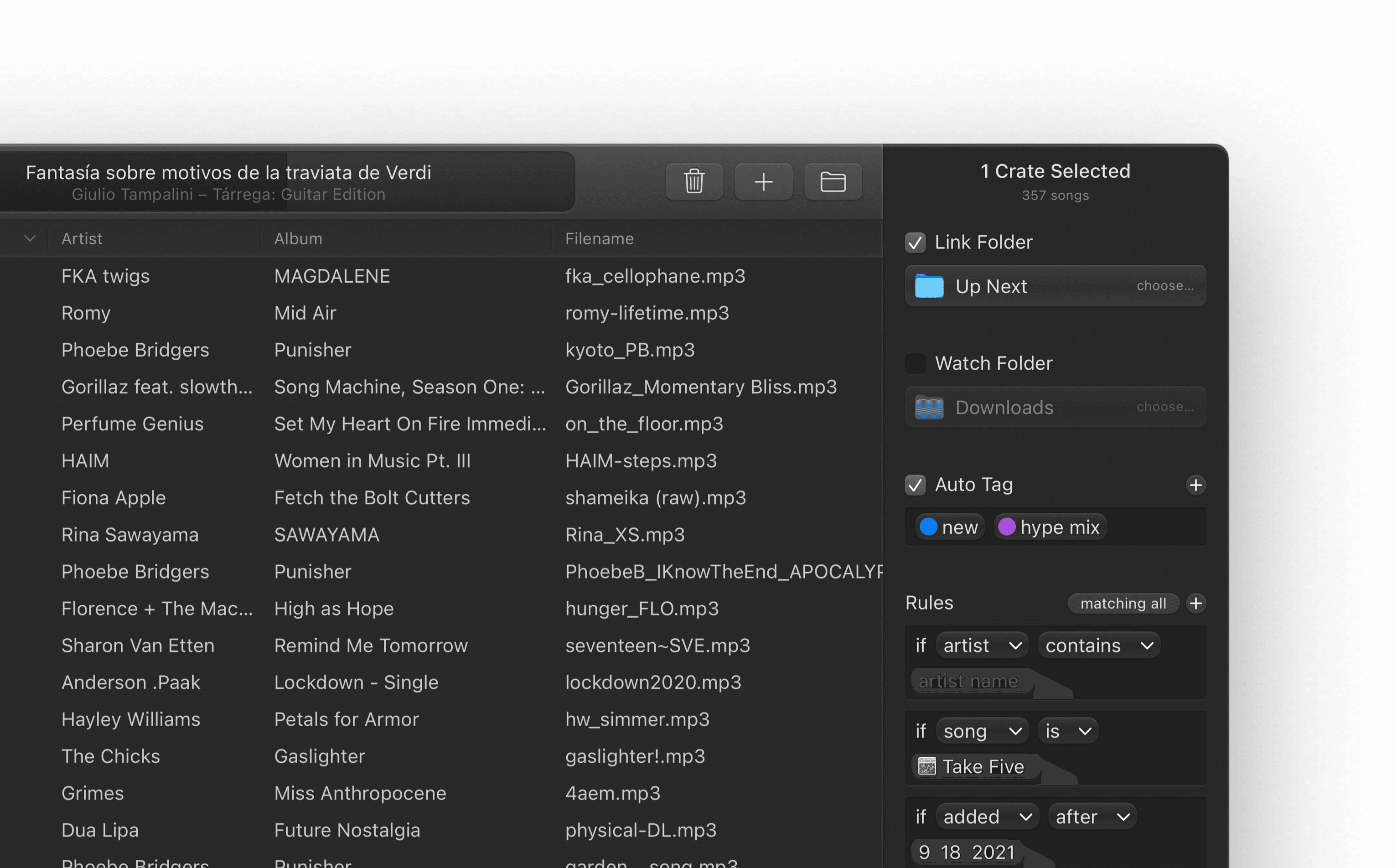
When crates are selected, the inspector greets users with Auto Tagging options, ability to set Link and Watch folders, and create Rules—conditionals that auto populate crates with matching tracks.
Scripts each have a set of customized UI to make them instantly understandable
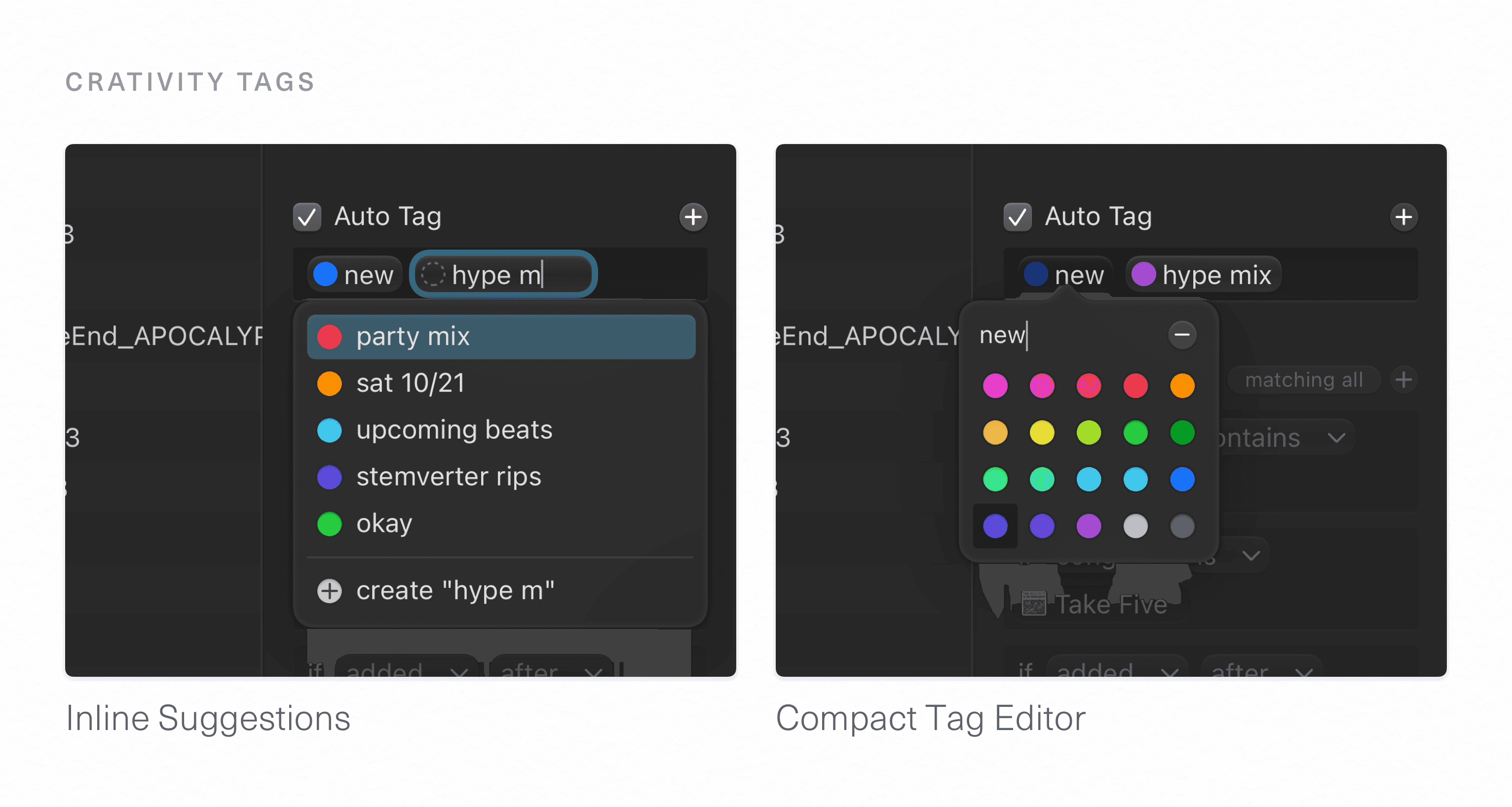
Tagging is made simple through inline suggestions and a curated color palette—mapped perfectly to the colors in Serato. Green tags in Crativity will still be green in Serato, albeit in a less pleasing shade.
Now Playing
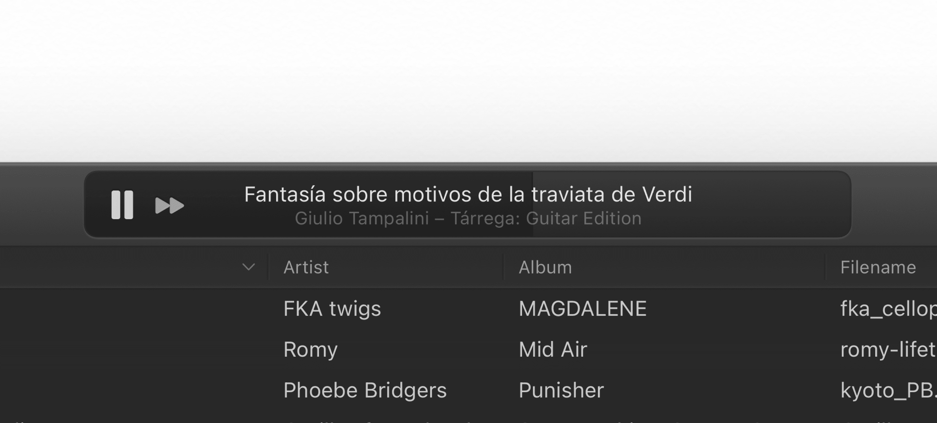
While Crativity is mainly an organization app, DJs often quickly scrub through and preview tracks while managing their libraries. I designed an entirely new interface for playback control that reduces visual complexity and delivers a unique experience.
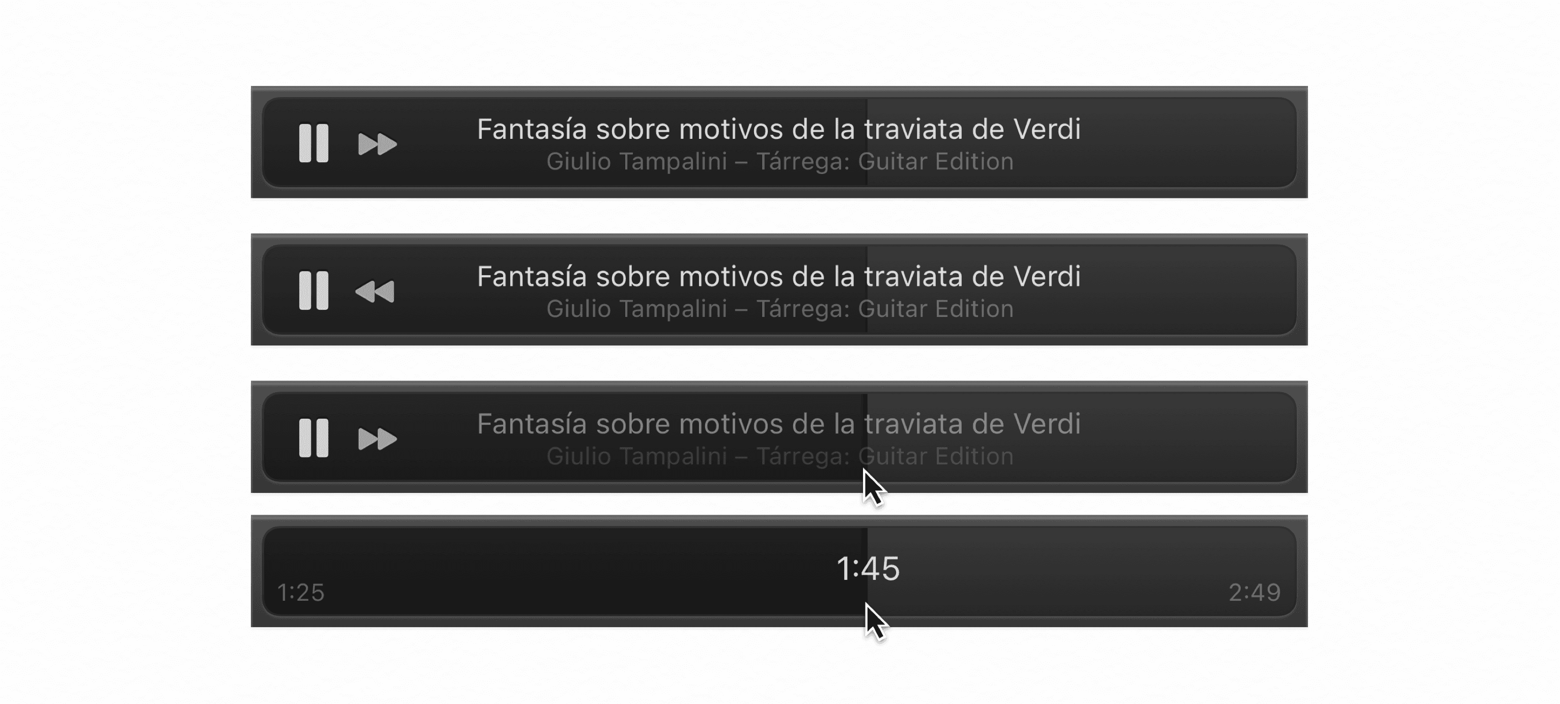
When a track is playing, the user can see far more of the track name, album, and artist, since the controls themselves have been minimized and placed at the leading edge. To scrub, instead of reaching for a tiny track thumb, the user can drag anywhere on the entire playback region—the entire view is a scrubber. I crafted a delightful animation for all stages of this interaction.
And since this is a Mac app after all, the hidden previous-track button is made accessible by simply holding down the option key.
Duplicates Manager
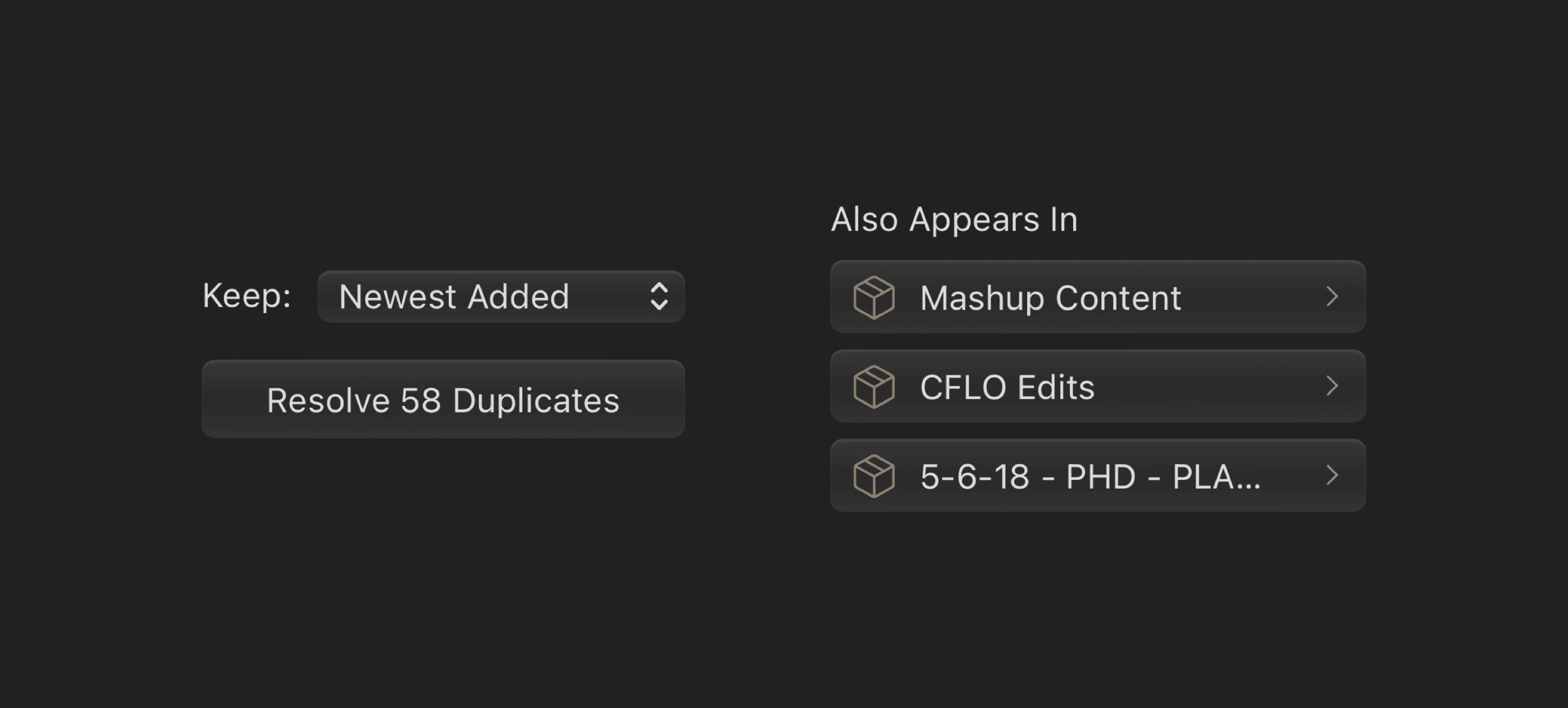
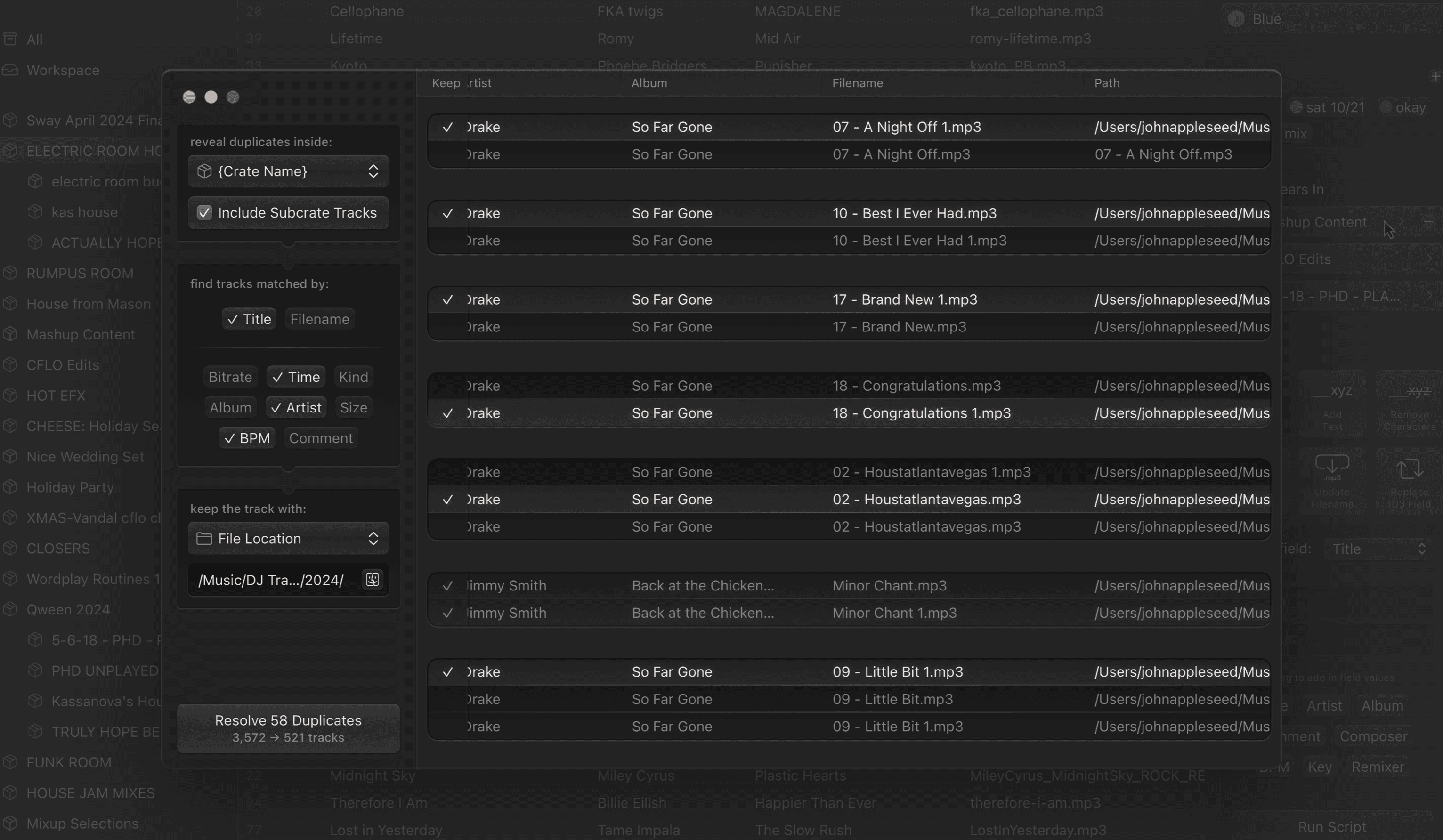
The large music libraries DJs deal with often include unwanted duplicate songs. These extra tracks slow down even the fastest systems and add confusion at the worst times—on stage. I designed an approachable interface to make this traditionally daunting task as simple as three easy steps.
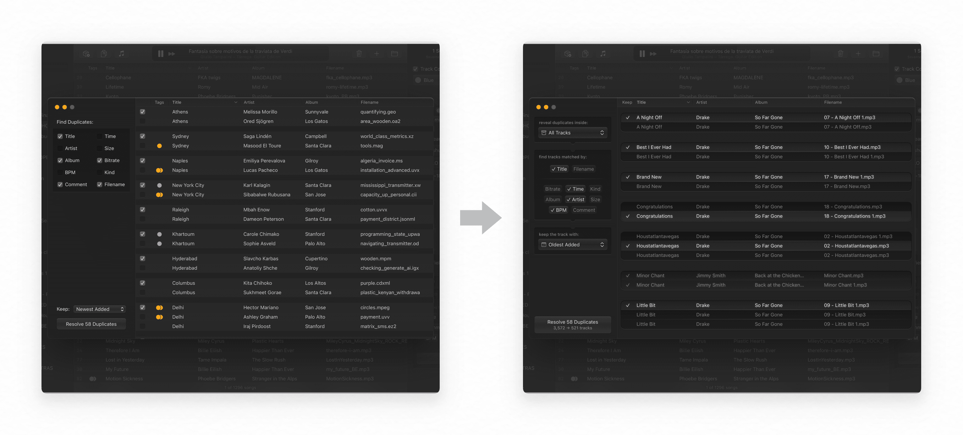
What initially began as a grouping of checkboxes was expanded, after design reviews with customers, to a clear ordered flow:
Unique interface elements I created, like the match parameter cluster I wrote in SwiftUI, make it easy for users to filter through their library, confidently identifying duplicates.
This feature is so thorough and powerful that the company produced it as a standalone app, Dupes.
Final Design
My design process, heavily reliant on expressive iteration, was informed by feedback from artists and discussions with customers. The final design delivers an incredible amount of power in an interface that is clear, bold, and unabashedly at home on the Mac.
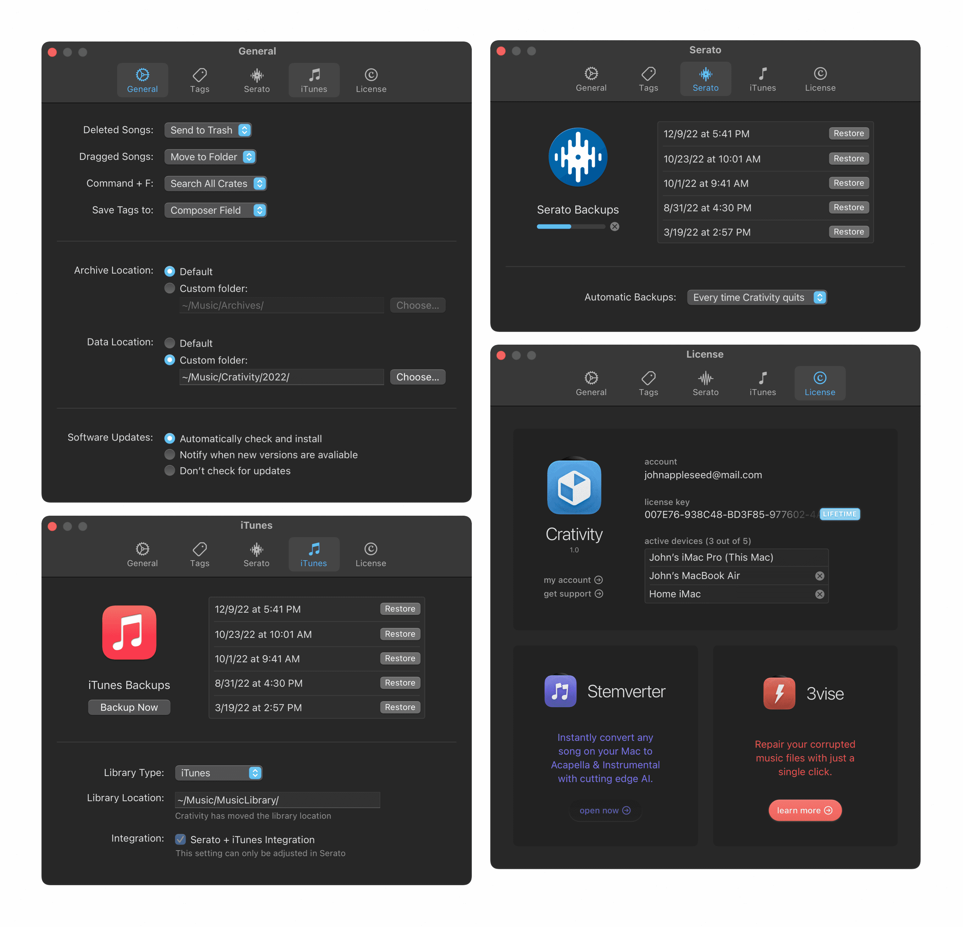
Great Mac apps have to feature useful Settings—I crafted preferences pages that are comprehensive and clear. Screens follow the Human Interface Guidelines for Mac apps.
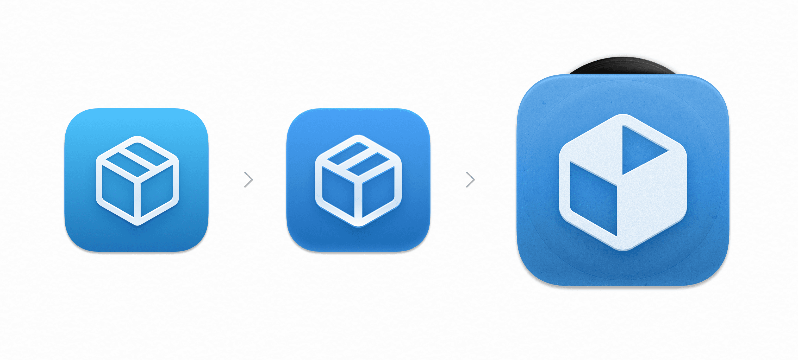
I designed the Crativity app icon. Mac apps have a rich history of realistic textures, and I reflected some of that in the final rendering.
Docs & Handoff
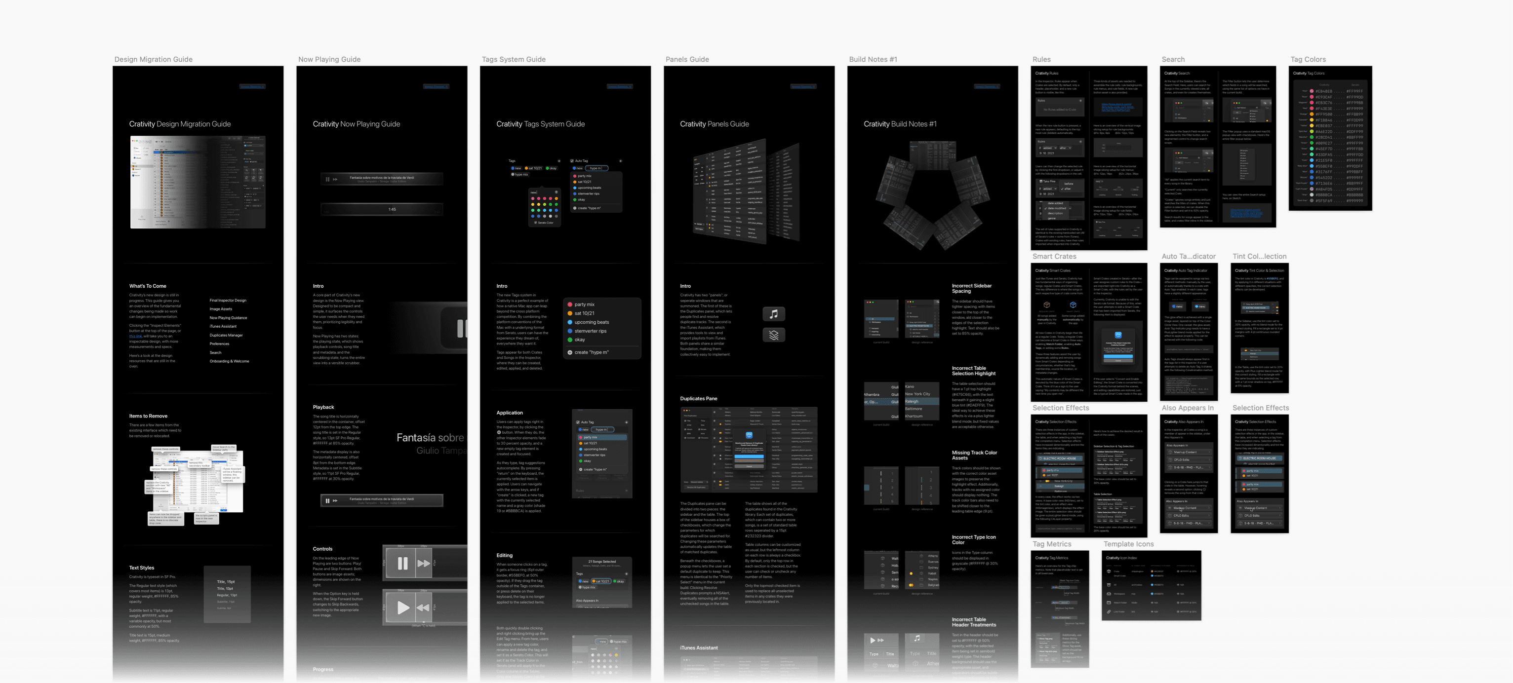
Besides the pixel-perfect design resources I delivered to the engineering team, I also wrote 14 highly detailed feature deep-dives. Each one explains the exact behavioral and visual details for a particular part of the app, with rich visual examples.
I worked closely with engineering (even contributing some SwiftUI components myself) to make sure that the shipping interface looked identical to what I had envisioned in the design, and matched what the team hoped to achieve.
Outcomes & Learning
The result of this work is a tool that is indispensable to artists and DJs. The interfaces I designed surface powerful new capabilities in a way that feels human, not technical.
Through Crativity, I have gained a deep respect and detailed understanding of what exactly makes a great Mac app. I’m incredibly grateful for the experience I had working on Crativity—I learned so much from the incredibly talented engineers I worked along side, and the incredible DJs who make art with the product I helped to create. There is no greater honor in design than getting the opportunity to make the tools someone else uses to do their best work.
A Whole Family of Apps
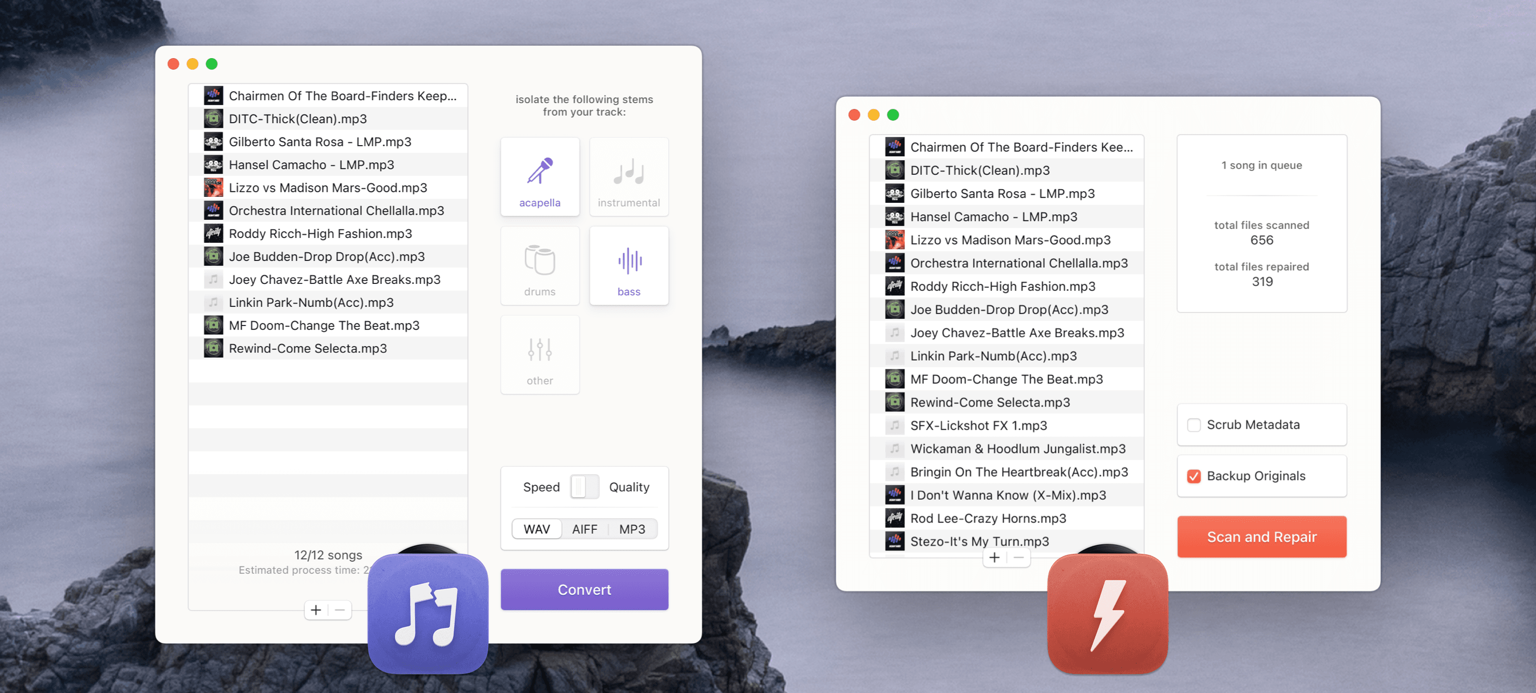
Crativity wasn’t the only Mac app I worked on at CFLO… I also redesigned 3vise and Stemverter, two popular audio utilities used by thousands of performing DJs.
But that story is for another day.
