In the summer of 2023, I worked on the analytics team at Pluralsight, a company that produces technical training content. Pluralsight User Analytics, the product I worked on, shows key metrics for each learner in an orgnization. The previous design had served the company well, but as the complexity of the platform grew, it was clear we needed a new direction. I led the design of an all-new interface for User Analytics, and worked directly with engineering guiding the implementation into production.
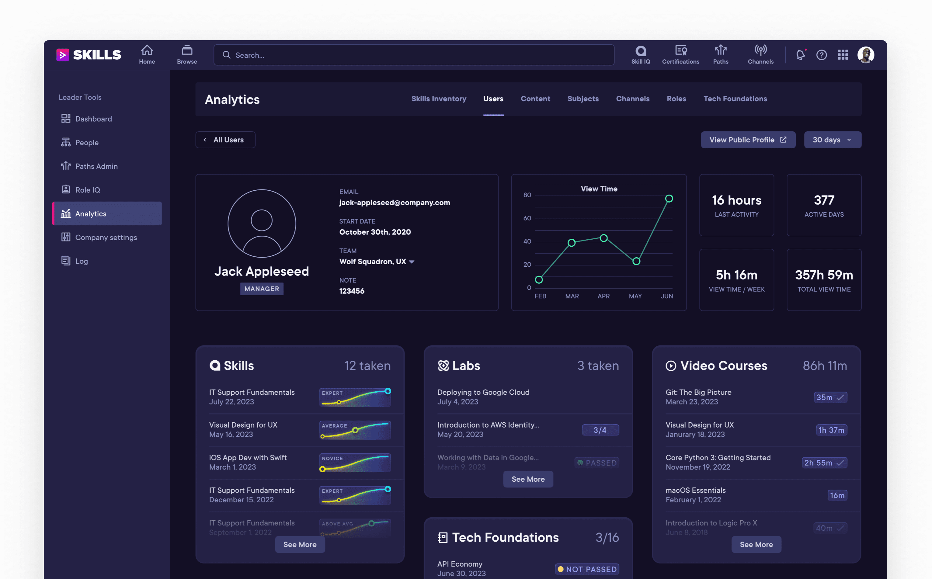
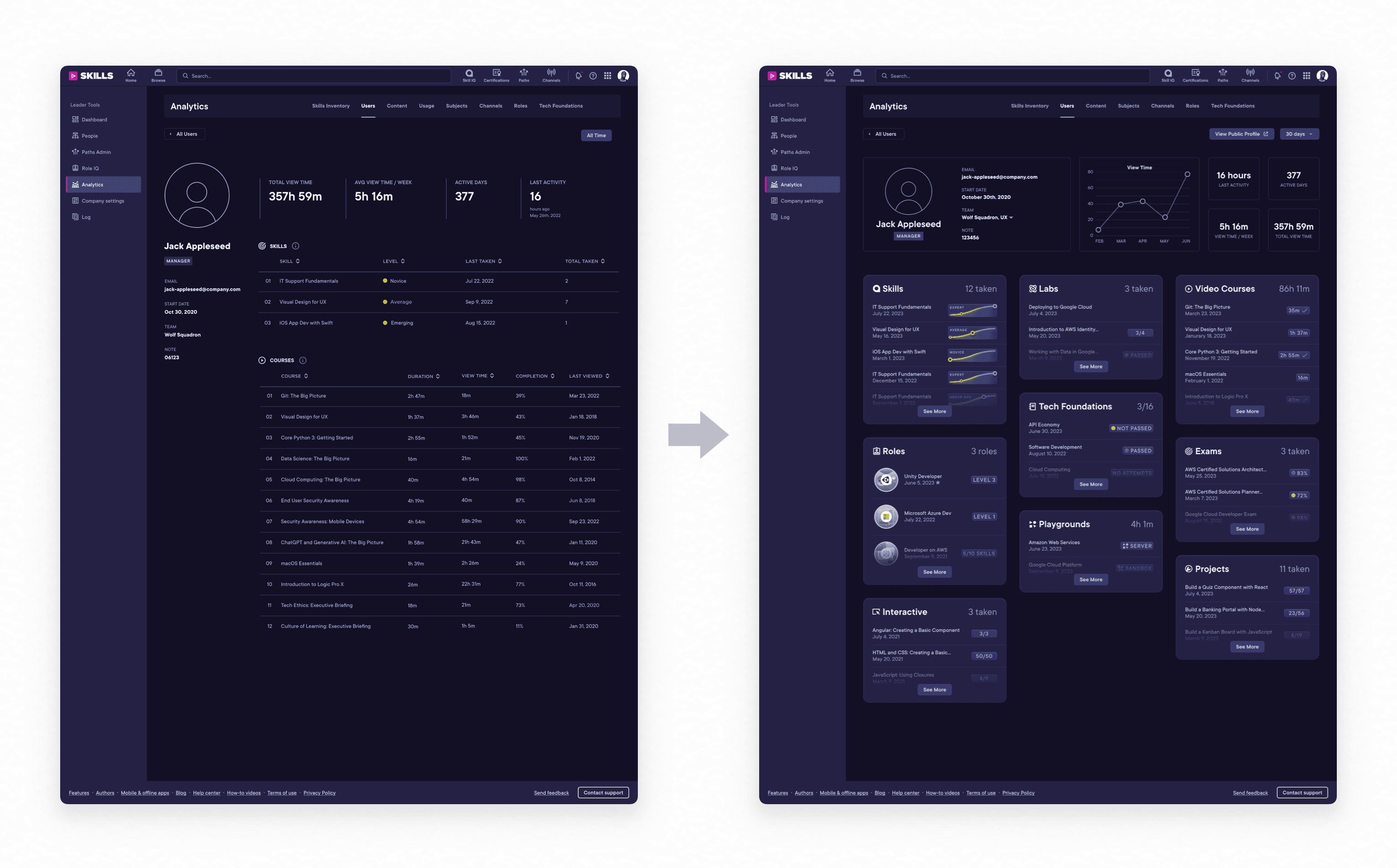
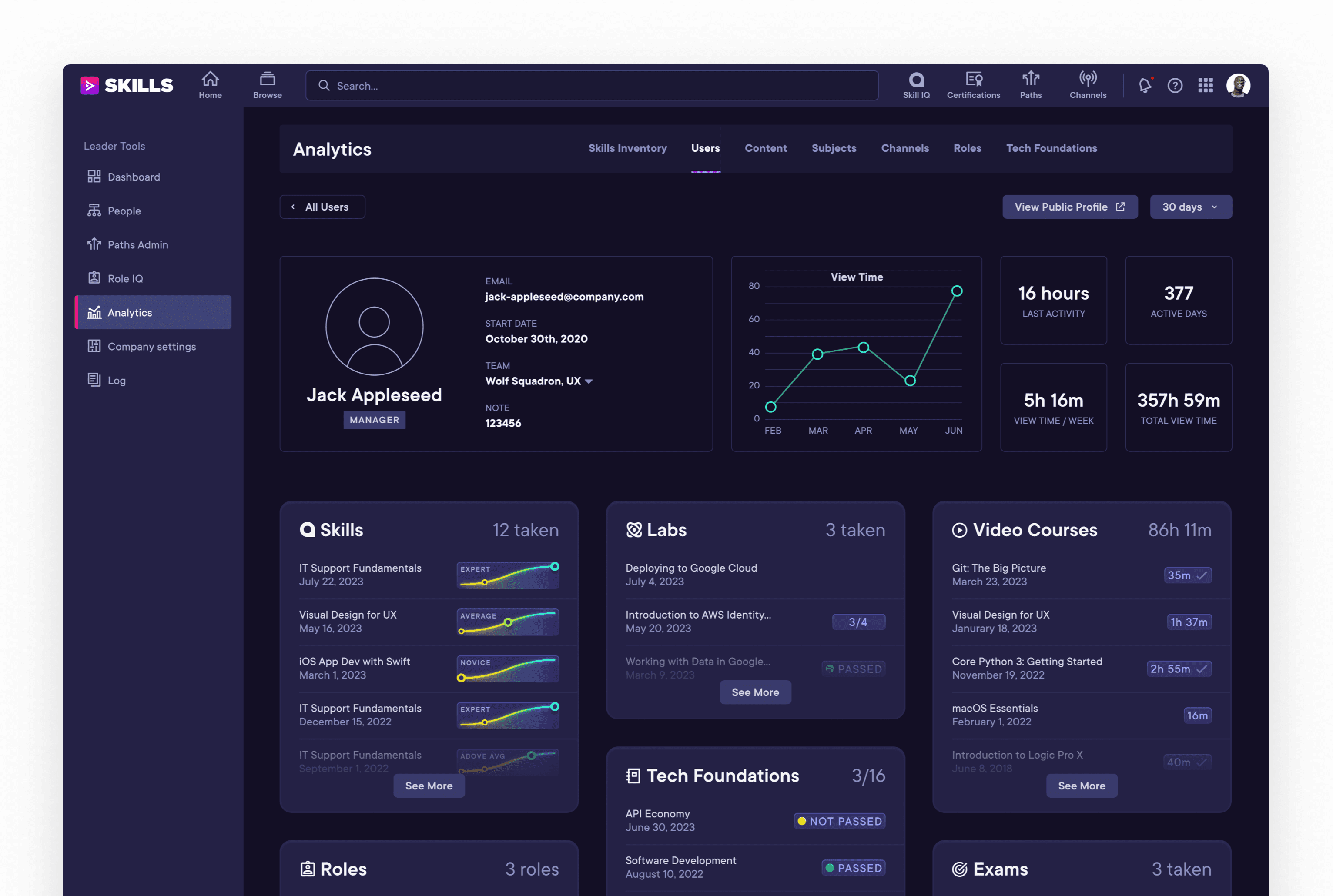
The redesigned User Detail view is a dramatic improvement from the previous design, and introduces numerous enhancements to the experience.
Research
For User Analytics to become an essential part of the Pluralsight experience, it needed to provide a holistic picture of a user’s learning growth with insights from across all of Pluralsight, and condense all of that information into a quickly scannable interface.
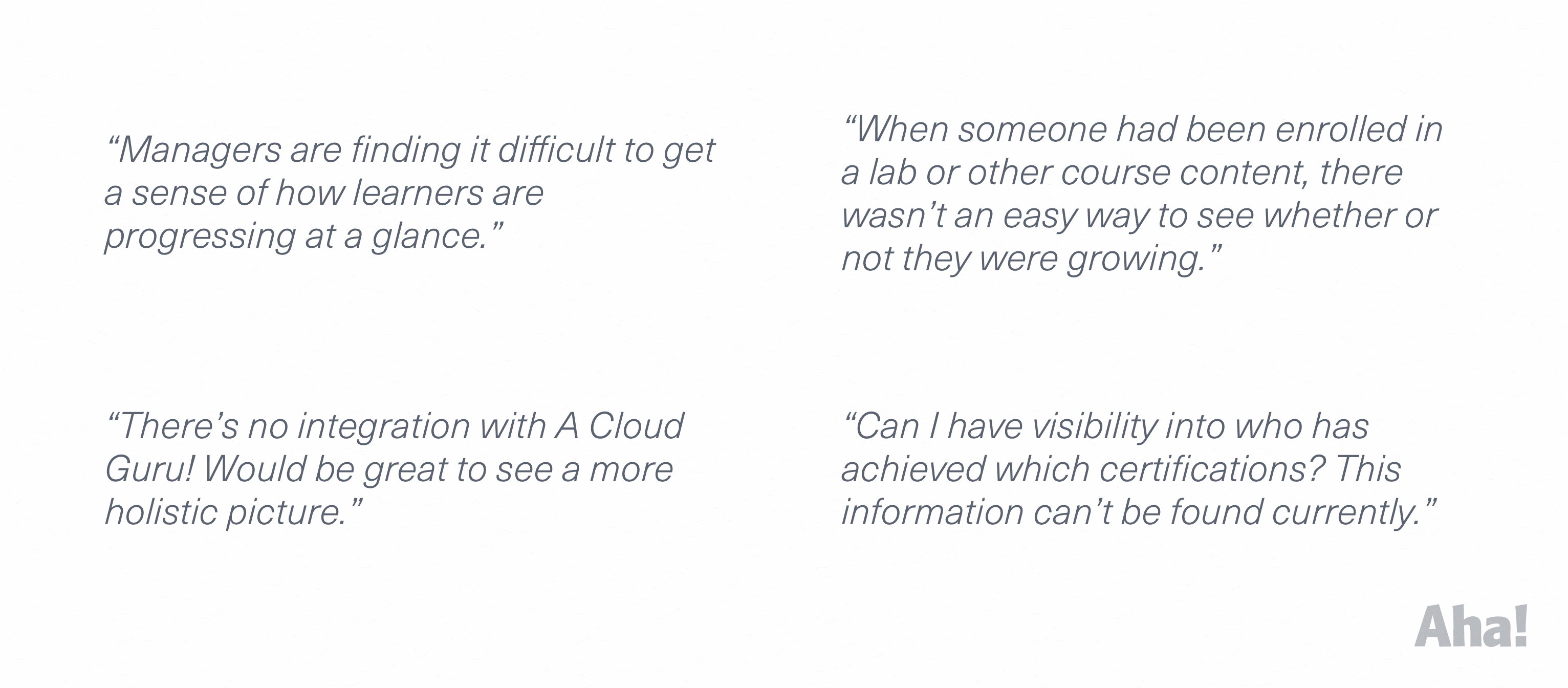
Research began with a review of customer feedback that had been collected over the years in response to the previous design.
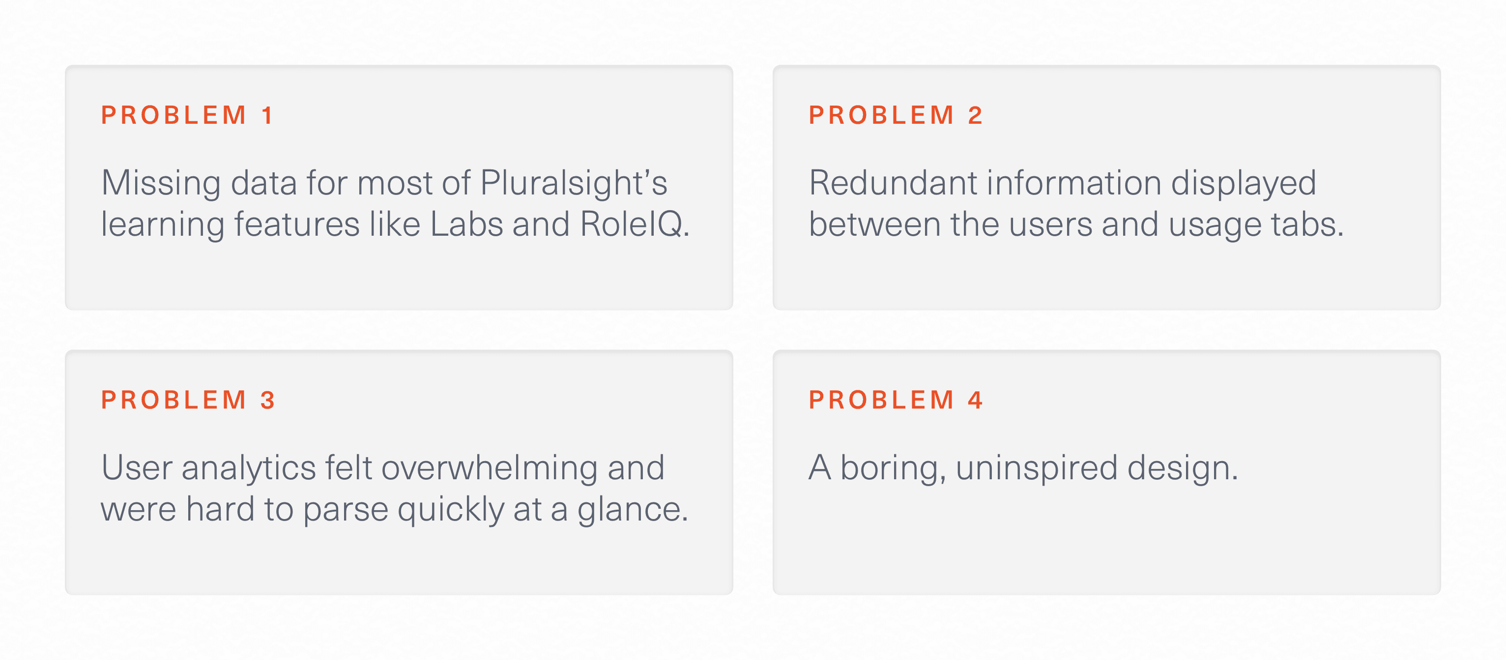
Informed with this customer feedback and my own thorough evaluation of the existing interface, I determined clear and actionable design goals:
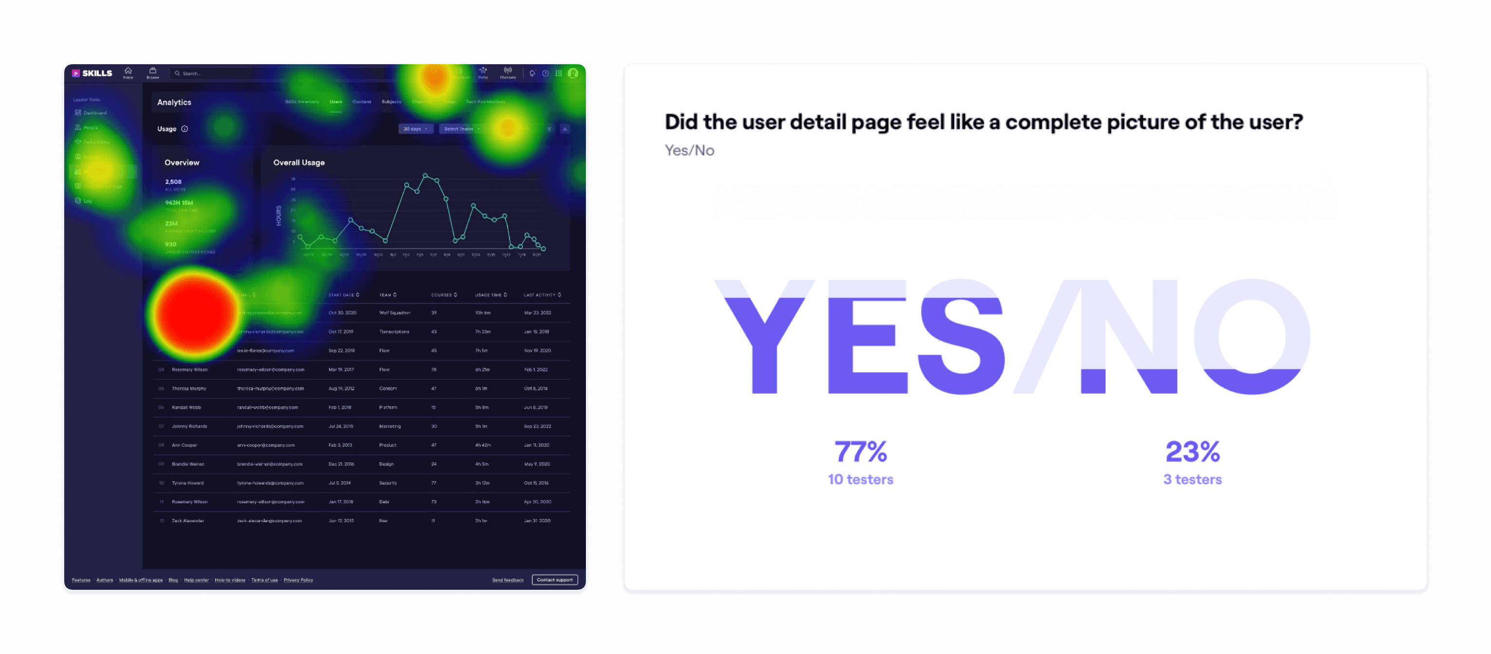
After I created an early interactive prototype, our team began testing it with a group of 25 customers and collected their thoughts. We learned that users highly valued seeing more at a glance. New components I created to illustrate roles, skill levels, and activity completions give users a “gestalt” sense of progress that just didn't exist with the prior design.
Rethinking Layouts
Organization became key with seven learner metrics added in the new design.
The obvious approach to show this new data was to simply expand the existing pattern: a single page with inline tables. I created new affordances to make this style more tenable, like minimize buttons and even a contextual scroller.
Table Minimize
I created new “minimize” buttons to quickly compress and expand a selected table, focusing the interface on the data the user was looking at. I rejected this design because it didn’t solve the fundamental layout issues—minimized tables don’t communicate much to the user.
Index Scroller
To make navigating this long page easier, I designed a floating sidebar that appear contextually to display the section currently in view. Upon hover, it smoothly animated to show category names. I ended up rejecting this approach because it didn’t work well on mobile, but more importantly since it was just a band-aid over a more fundamental problem.
But it quickly became clear to me that a table-centric design wasn’t the right way to go—to see a complete picture users would be forced to do tons of scrolling, it wasn’t scannable. I made the decision to discard the table paradigm and conceived of a brand new modular layout.
Modular Cards
Now, the contents of each category are displayed in a compact card. Glanceable information is always visible on the top left of each card, with a few relevant rows previewed below.
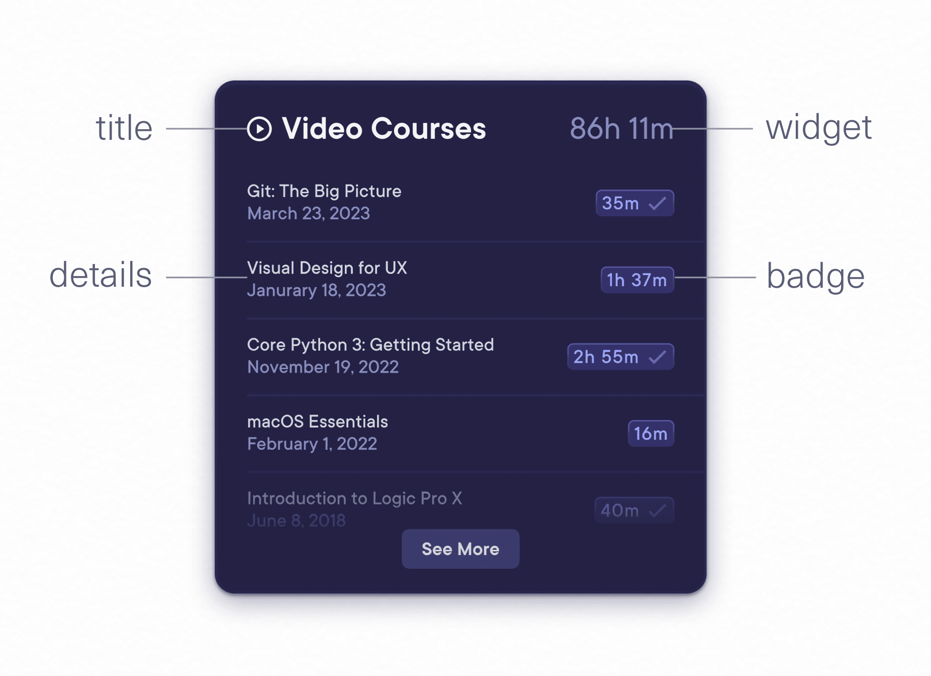
Card Anatomy
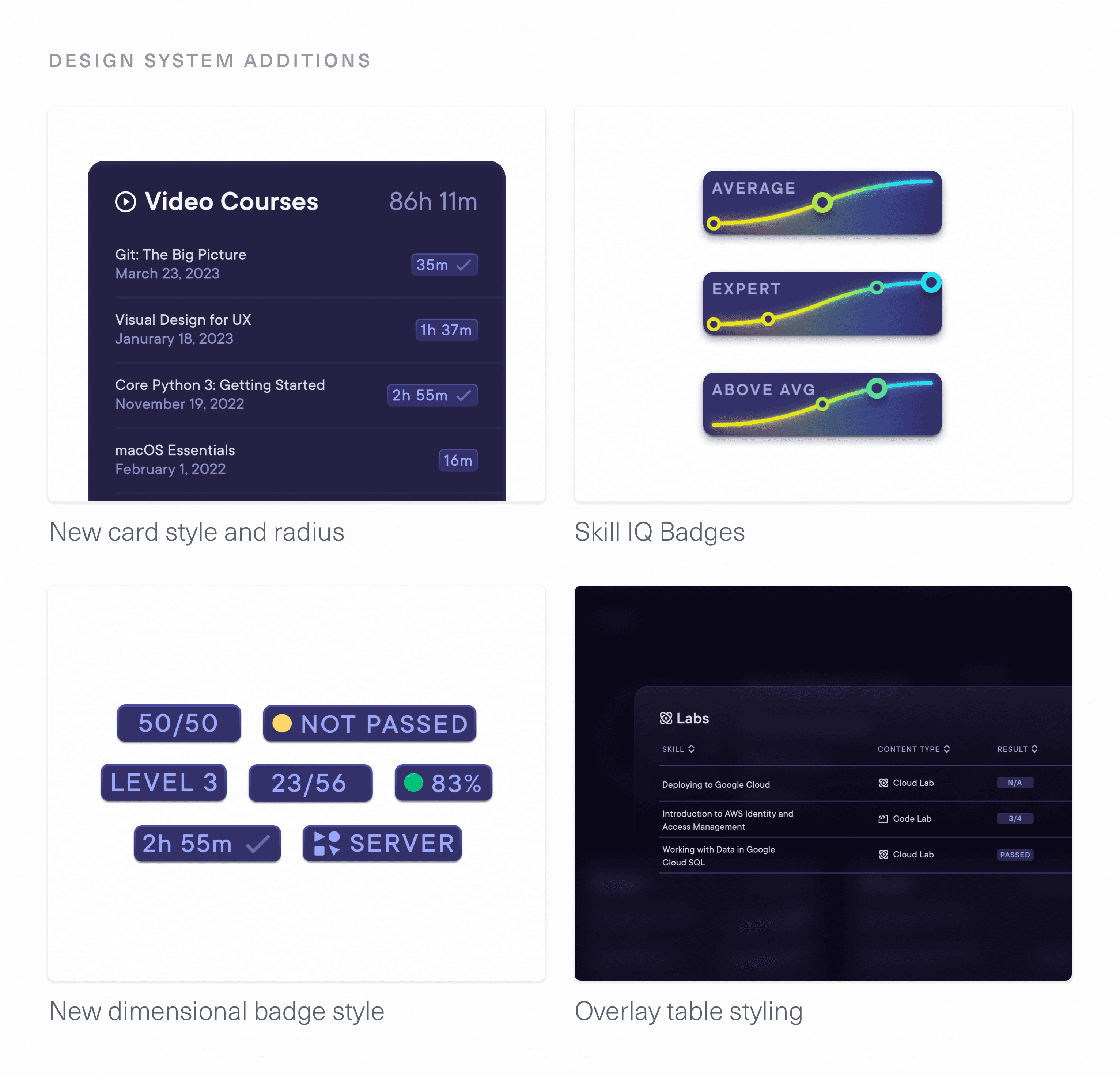
Each category has a slightly different set of priorities in terms of data being displayed. I designed the card system to accommodate and highlight this. Unique badges clearly communicate the most relevant statistics.
And with just a single click on any card, users can access the entire table of data as a modal view.
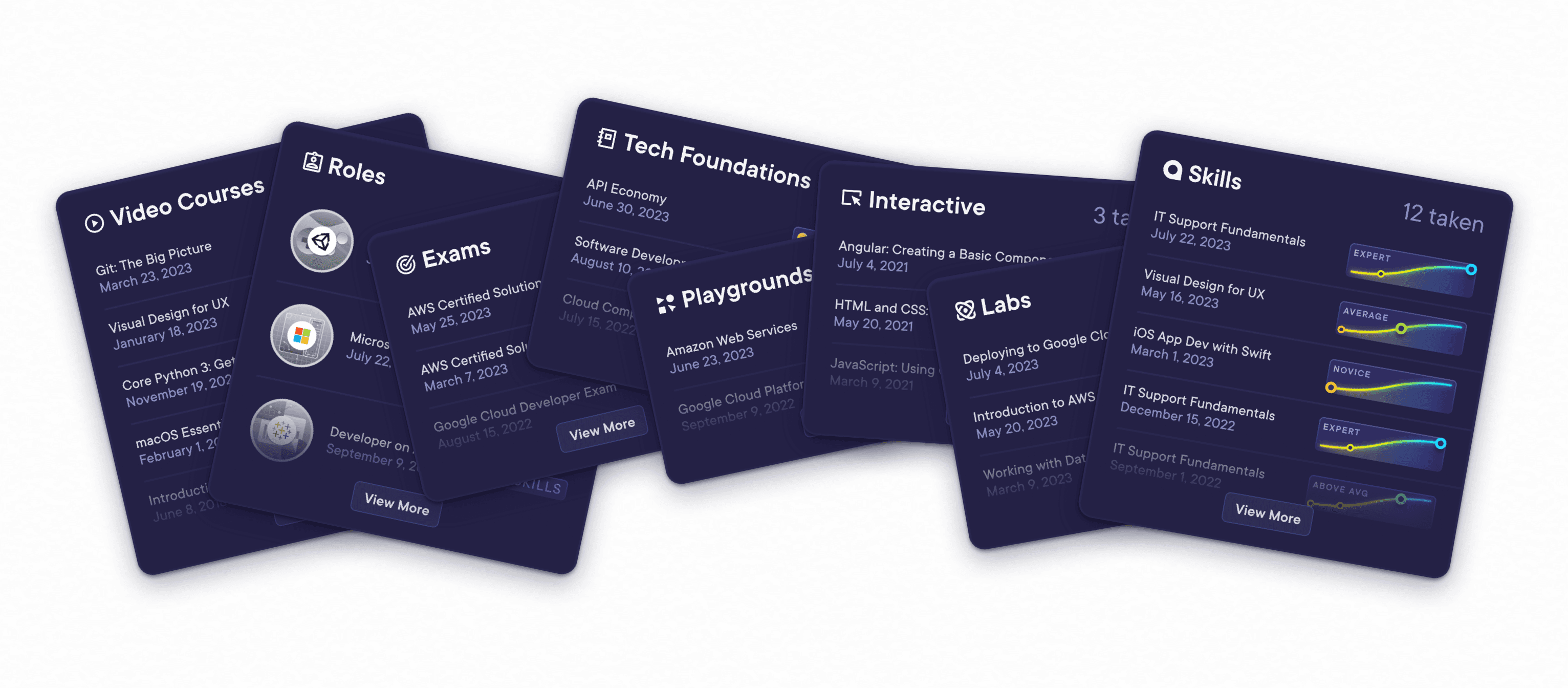
This new design is not just far easier to parse for users—it’s future proof. It’s trivial to add new categories, each with unique data visualization needs. To facilitate this, I designed a few concept cards to make updates easier for the team in the future.
Showing the Growth Story
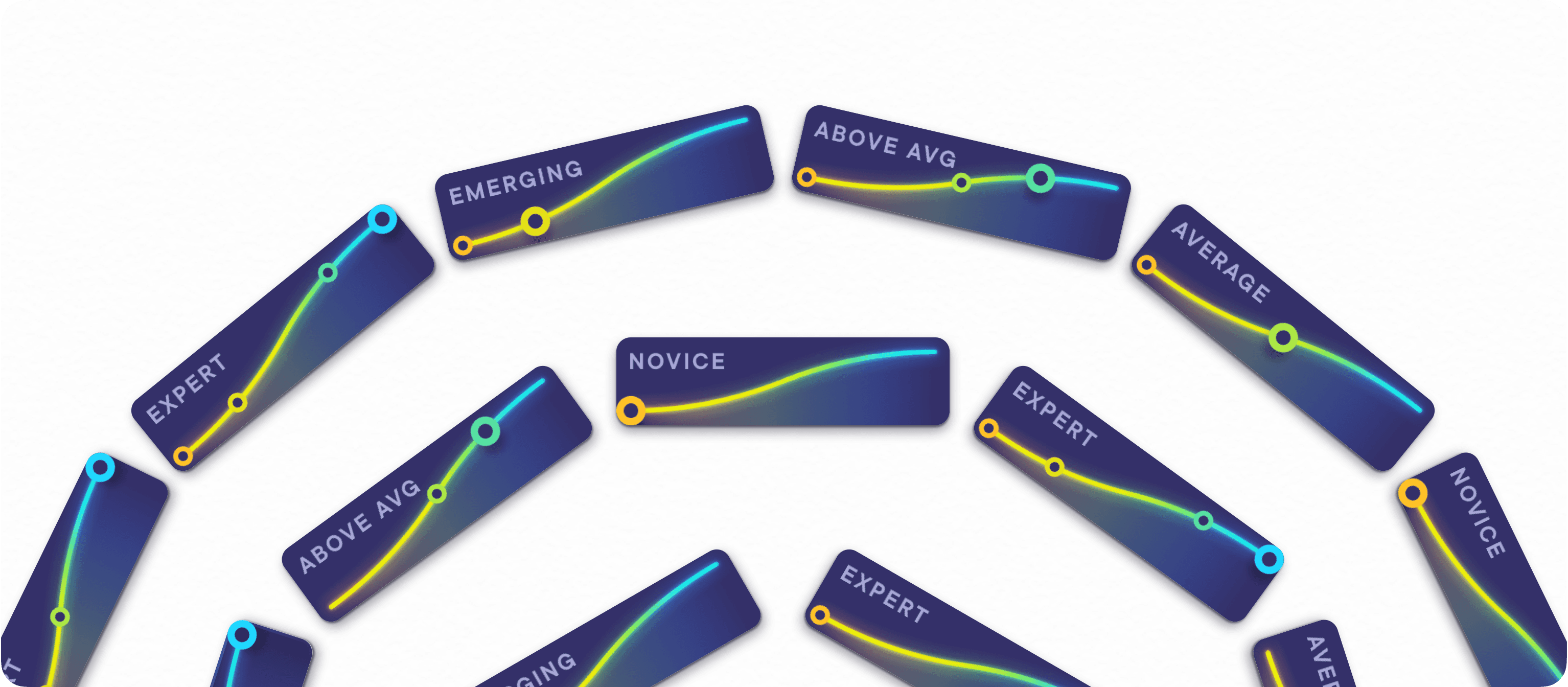
A core element of the Pluralsight experience is Skill IQ—assessments learners take to gauge their growth. Skill IQ was previously represented via status badges which displayed only the learner’s current level. These badges didn't tell the user anything about growth—how a learner had progressed, and where their current level was in relation to others. I designed a brand new Skill Badge to clearly communicate growth, not just current state.
Visual iteration was key to developing a robust, beautiful component that could be reused across the entire Pluralsight platform.
Skill IQ Badges efficiently display a multitude of user’s growth journeys.
Removing Redundancy
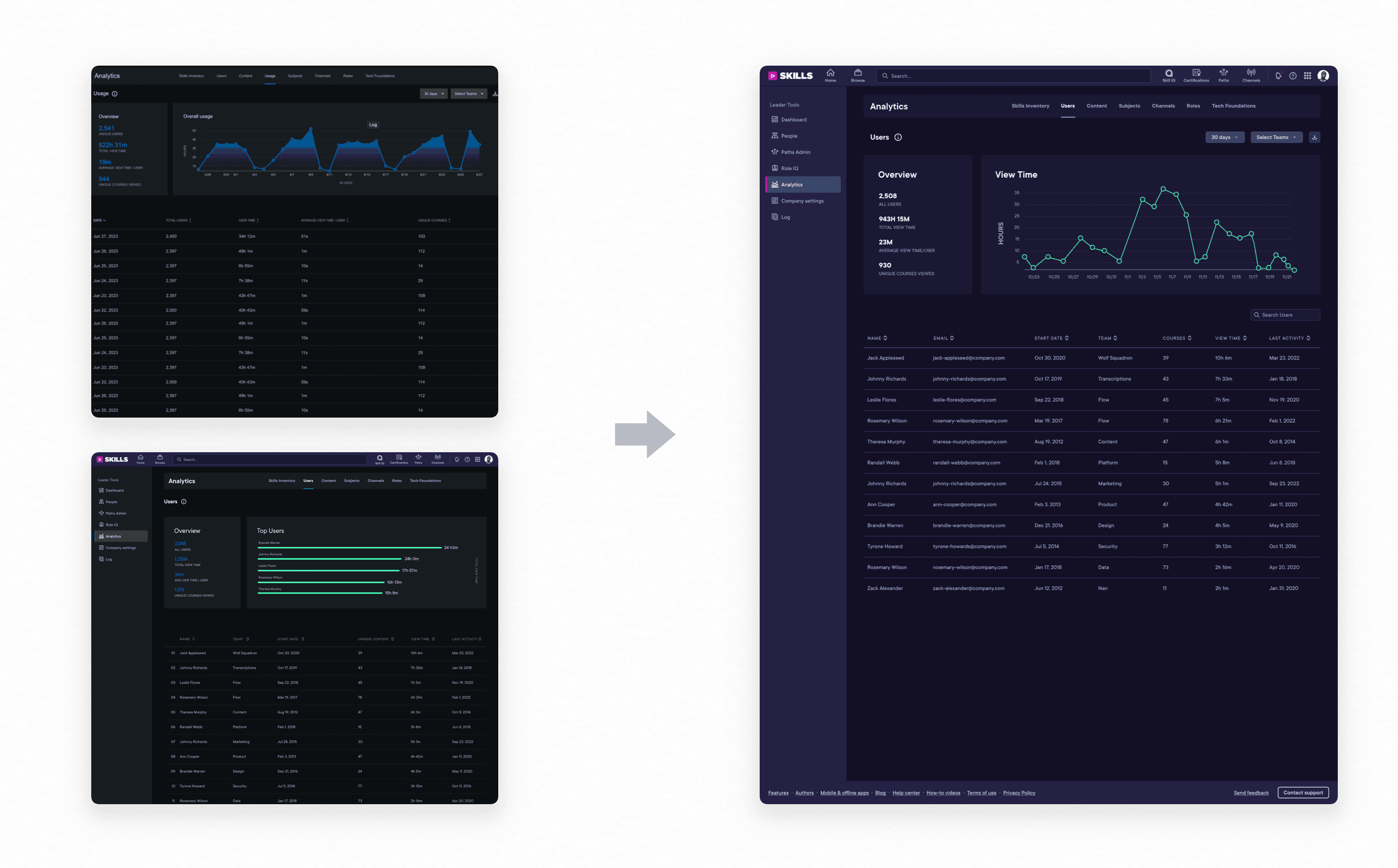
The main Users Report, which displays analytics for all learners in an organization, was outdated and didn’t have a clearly defined role. It had yet to be updated to the latest “Pando” design system style, and contained information that was largely redundant with another tab, Usage. I pushed to unify the two, and designed an improved page to facilitate the merger:
With testing we learned how, for the first time in a while, customers finally found this tab useful again.
Final Design
The reimagined User Detail page empowers customers to instantly understand how a learner is growing with Pluralsight. With a quick glance, it’s easy to see what skills a learner is developing, where they are strongest, and what parts of Pluralsight they are taking advantage of to get there. This information is essential for organizations to see the benefit of the product—if growth isn't made clear, why even pay for Pluralsight?
Luckily, my new design helps to accomplish just that. The core values I helped to set at the outset of this project—glanceability and comprehensiveness—were north stars that shaped the final interfaces.
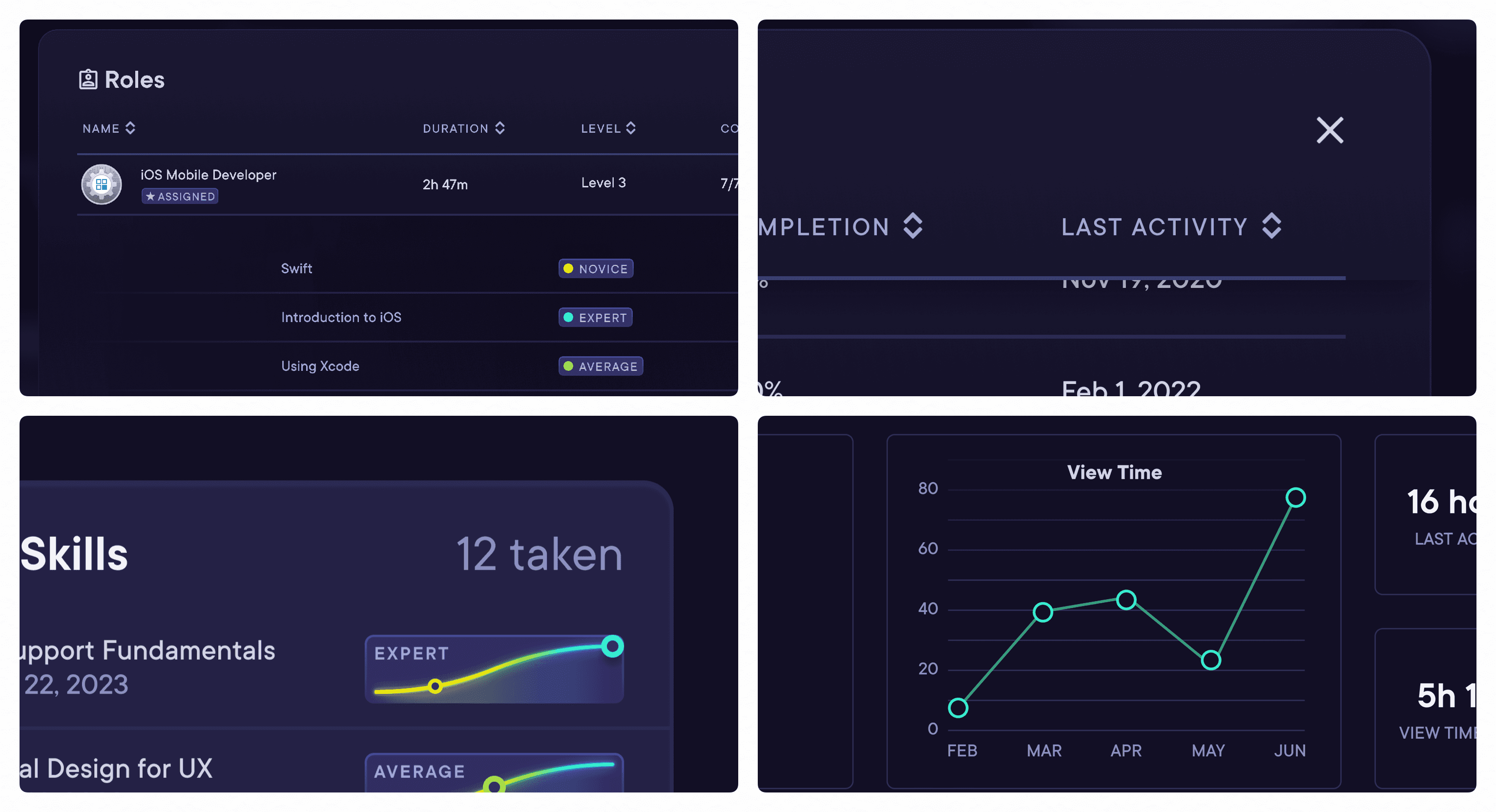
A single page provides a birds-eye view of a learner’s journey, with dynamic widgets highlighting the most important datapoints to customers.
Strong visual design transformed the analytics experience, making it not just a useful part of the platform, but a delightful part of the Pluralsight experience.
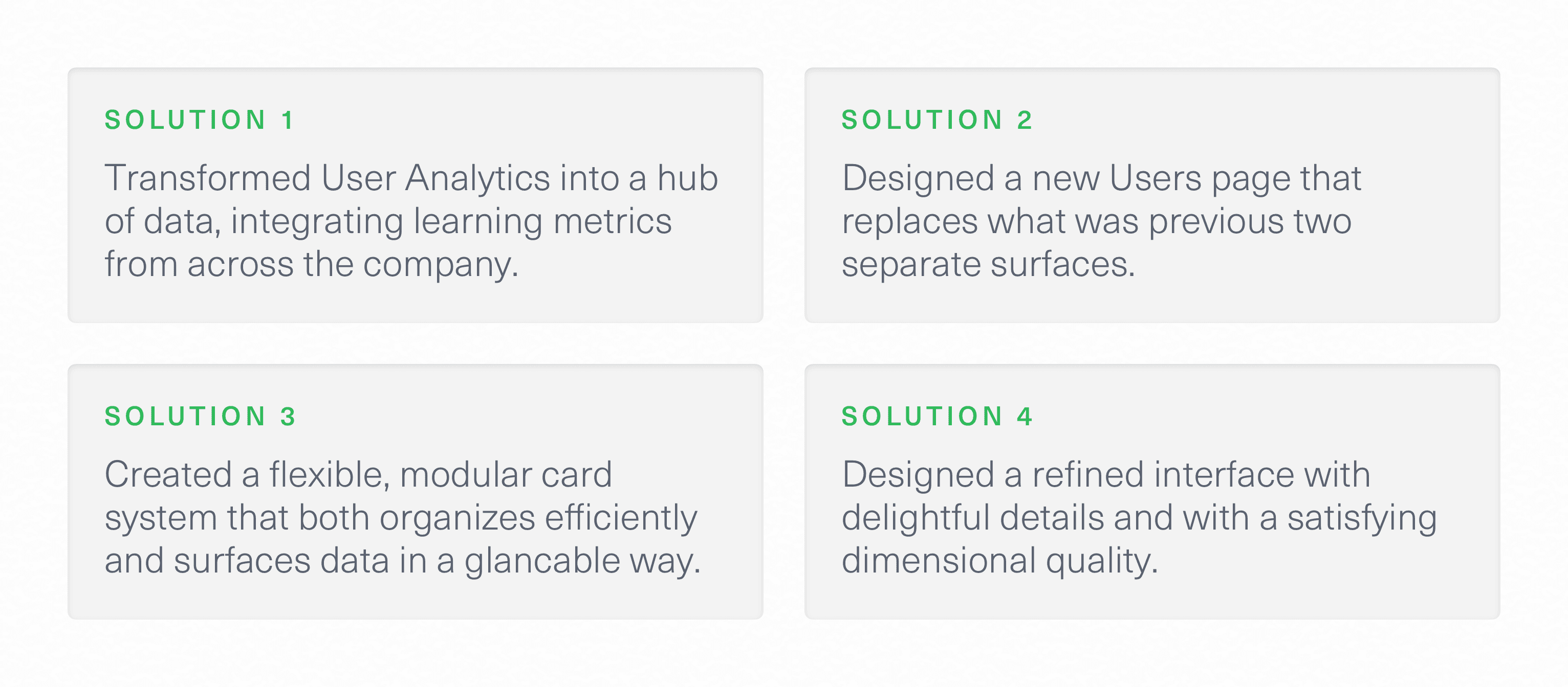
Through an interative design process and careful attention to detail, I provided solid solutions to our design goals:
Handoff
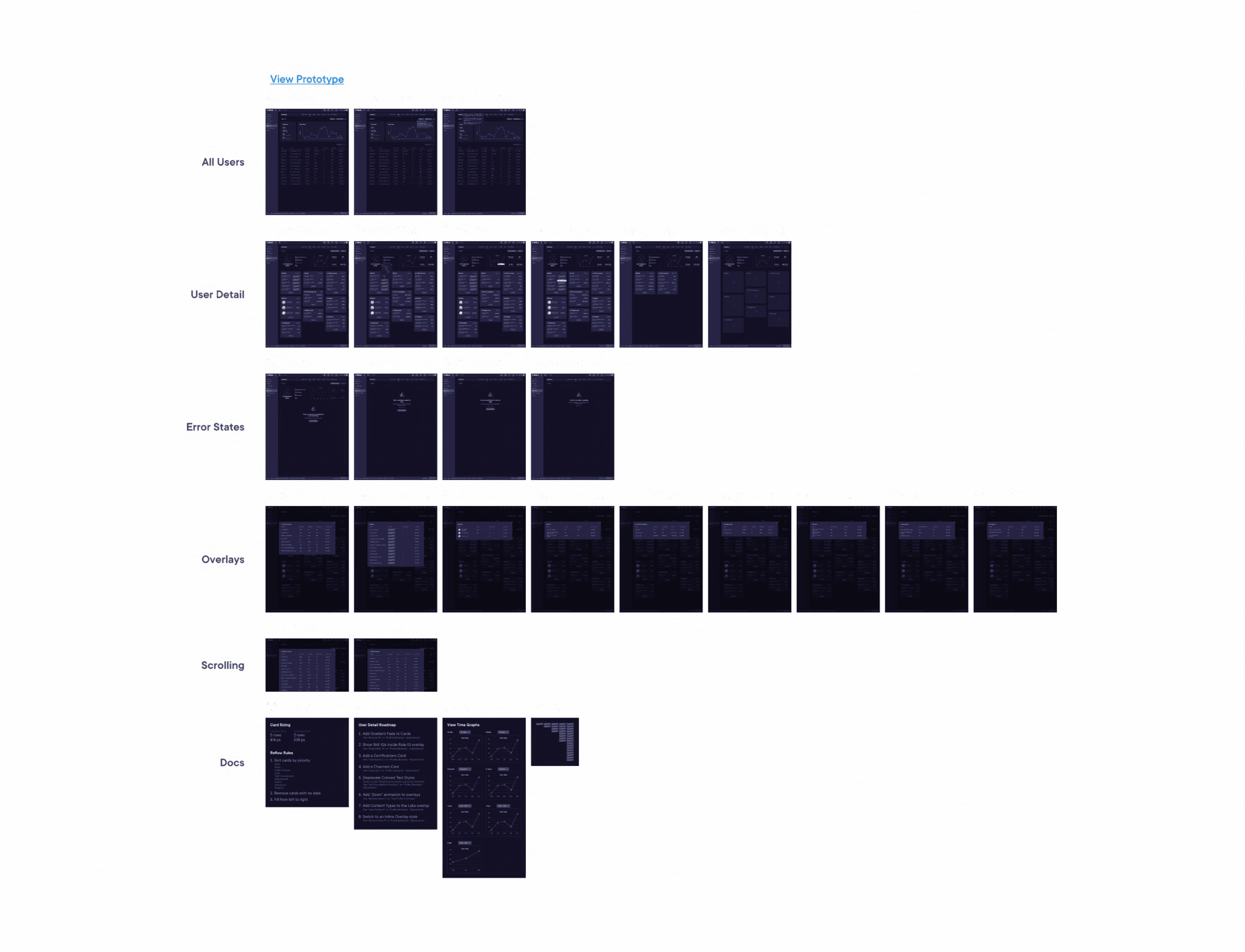
The new User Detail page reflows dynamically, depending on what Pluralsight features a learner interacts with, and how often. The comprehensive documentation I wrote and Loom videos I recorded helped our engineering team perfect these interactions. The interfaces themselves had many fine touches were delivered via pixel-perfect cleanly labeled handoff documents. I helped engineers on the team to strategize approaches for the more ambitious visual components of the project—the resulting experience is equally intuitive and visually striking.
Some of the design details, particularly the card system and new surface treatments, presented new styles for Pluralsight. I worked with the design systems team to add some of these elements as standards going forward.
Outcomes & Learning
The reimagined User Analytics experience solves all of the issues we set out to solve at the beginning of the process—and introduces a new paradigm for Pluralsight: the modular grid. Now, customers are able to quickly assess the state of a learner’s growth, with just the right information, delivered in just the right way.
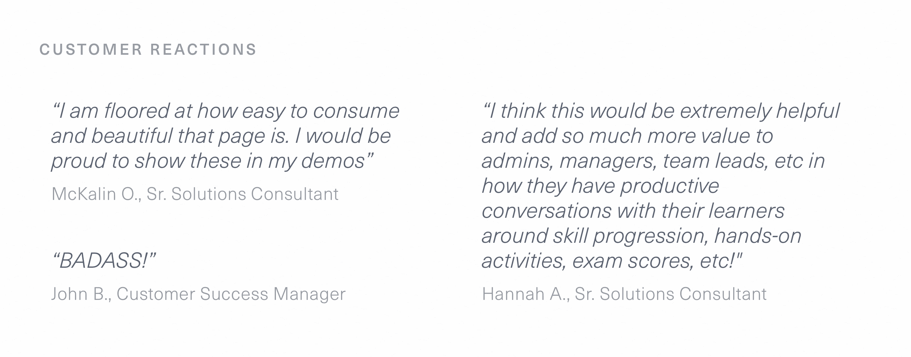
Of course, nothing is better than getting designs in the hands of others and seeing them love it.
I’m thankful for the opportunity I had to work at Pluralsight. By collaborating across disciplines, and always focusing on customer experience, I was able to craft an experience that not only delivers a compelling solution but lays the groundwork for years of product evolution. The many fellow designers, engineers, product managers, and executives who discussed problems with me and reviewed my work taught me so many things about attention to detail, setting reasonable timelines, and integrating features across teams. I’ll always appriciate the freedom Pluralsight gave me, as an intern, to reshape this core part of the product for the better.
